Did you know that a well-designed landing page can boost your email marketing conversion rates by up to 86%? 😲 🚀
If you're looking to maximize the impact of your email campaigns, creating a targeted landing page is crucial.
But where do you start?
In this post, you'll discover the essential steps you need to design an effective landing page to support your email marketing goals, including:
- The critical elements of a successful landing page
- How to ensure consistency between your emails and landing pages
- Optimization strategies
- Tips for analyzing and improving your pages.
Let's dive in!
What is a Landing Page?
So, when talking about email marketing, what exactly is a landing page?
In brief, it's a dedicated web page designed specifically to convert visitors from your email campaigns into leads or customers.
Unlike regular website pages, landing pages have a singular focus: to drive a specific action.
This might include:
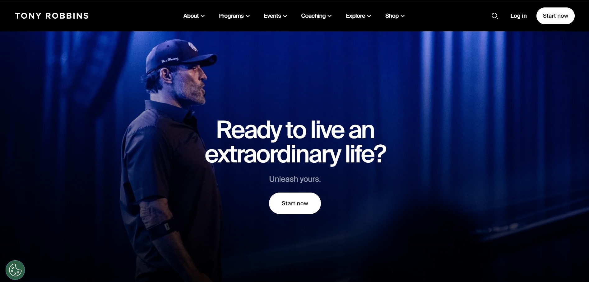
- Here's an example of a landing page from Tony Robbins.
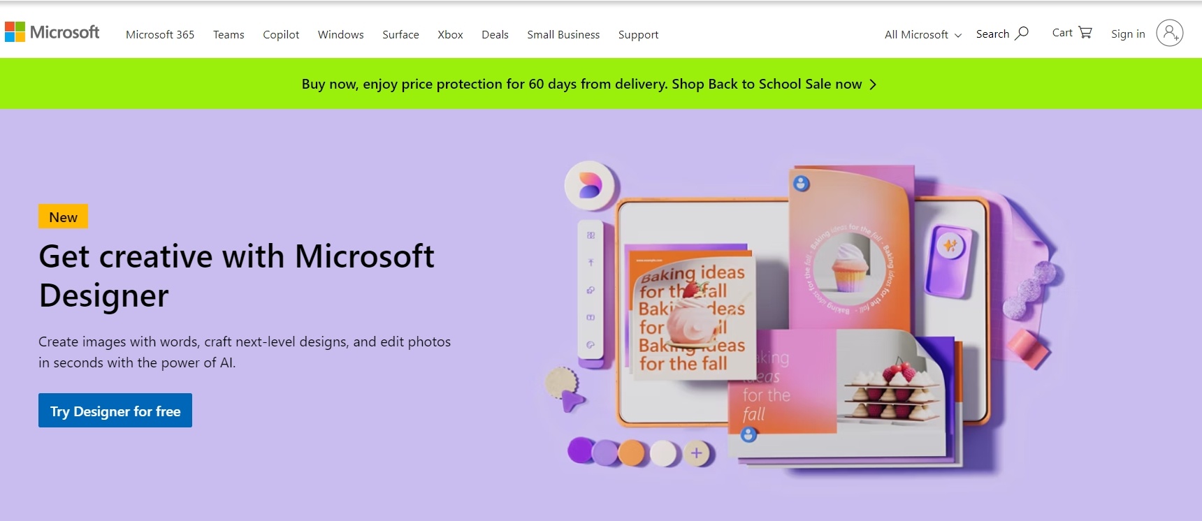
- In this example from Microsoft, the landing page invites visitors to try its Microsoft Designer app—that’s the only goal of the page.
Definition and Purpose
A landing page is a standalone web page created specifically for email marketing campaigns, as well as other types of promotion such as advertising campaigns.
The visitor clicks a link in an email (or ad, social media post etc.), and "lands" on the page.
Because the page focuses on a single call to action (CTA), conversion rates tend to be much higher than if the offer were included on a page with various other distractions and calls to action.
If you’re promoting a new product through an email marketing campaign, your landing page should provide detailed information about the product together with a clear, compelling CTA, such as "Buy Now" or "Learn More".
Benefits of Dedicated Landing Pages
By using a dedicated landing page instead of a more generic page, you get several key benefits, including:
- Targeted messaging—landing pages allow you to tailor your message to match the intent of your email campaign. This ensures a seamless transition for the visitor, keeping them engaged and increasing the likelihood of conversion.
- Better tracking capabilities—with a dedicated landing page, you can track specific metrics such as time spent on the page, conversion rates, and user behavior. This data helps you understand what works and what needs improvement.
- Reduced distractions—unlike regular website pages that might have multiple links and navigation options, landing pages are focused. There’s no sidebar or navigation to lead your visitor astray. It’s just you, your message, and the action you want them to take.
- Boost SEO efforts—tailoring landing pages to specific email campaigns and keywords can improve your SEO rankings for those terms. This targeted approach enhances user experience and can drive additional qualified traffic to your site.

- Test and learn—landing pages are perfect for A/B testing. You can experiment with different headlines, CTAs, and images to see which versions perform best. This data-driven approach allows you to continuously refine your strategies for better results. If you’re unsure how A/B testing works, here’s a quick intro:
In essence, a well-crafted landing page should be seen as an essential component of effective email marketing.
An effective landing page will contain messaging that resonates with your audience and drives them to take the action you want, maximizing your conversion rate.
Let's get some more details on the elements you need for an effective landing page...
What Are the Key Elements of an Effective Landing Page?
Creating an effective landing page for email marketing requires attention to several key elements which we'll detail here.
Each component plays a crucial role in capturing your visitor's interest and driving them to take action.
Compelling Headline and Subheadings
Your headline is the first thing visitors see, so it needs to grab their attention immediately.
It should be compelling, clear, and directly related to the content of your email.
A strong headline highlights the main benefit or solution you’re offering.
If your email promotes a free eBook on digital marketing strategies, your landing page headline might be:
- “Unlock the Secrets to Digital Marketing Success – Download Our Free eBook Now!”
Use subheadings too to help break up the content and make it more scannable.
Your subheadings should provide additional information that supports the headline and guides the reader through the page.
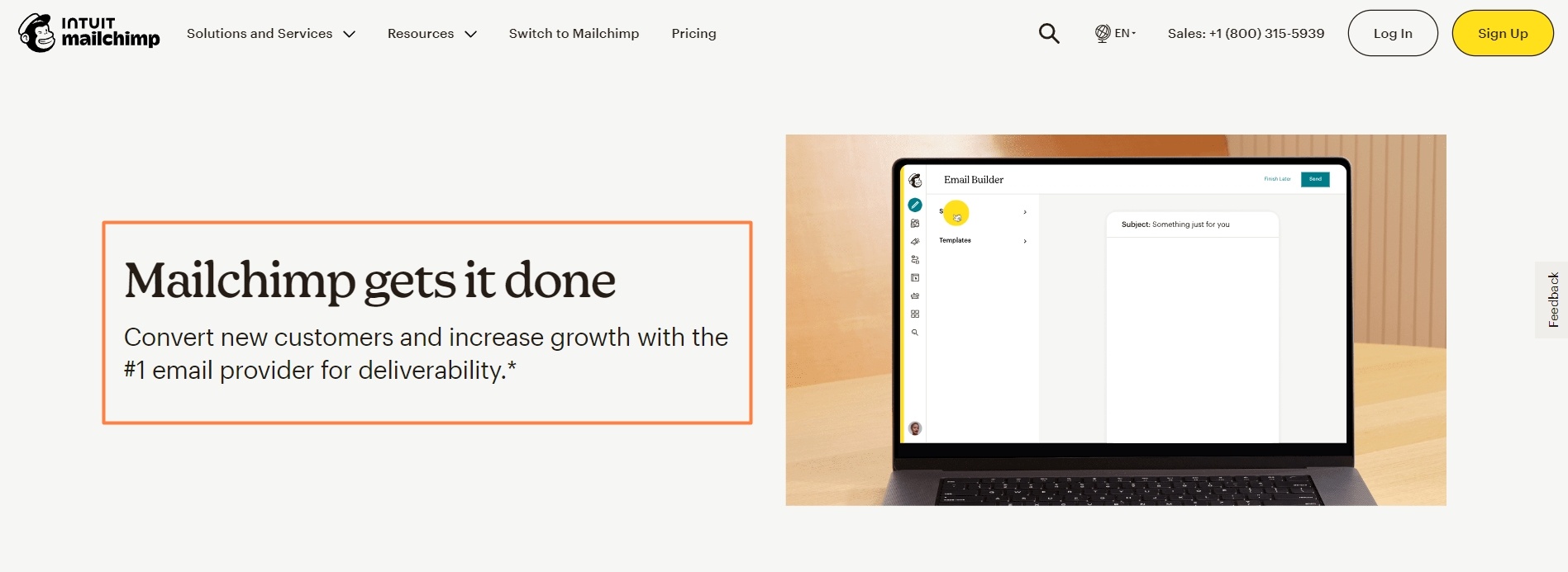
In this example from Mailchimp, the headline is simple and powerful, conveying that the product is effective and reliable. It aims to build trust and confidence for potential users by promising to deliver results efficiently.
The subheading (“Convert new customers and increase growth with the #1 email provider for deliverability”) reinforces the headline by providing specific benefits, namely converting new customers and increasing growth.
It also mentions Mailchimp's top ranking in deliverability, again building confidence in their solution.
Complementary Visuals
High-quality images or videos can significantly enhance the appeal of your landing page.
They should complement the text and help convey your message more effectively.
If you’re promoting a new software tool, include screenshots or a demo video to showcase its features and benefits.
Visuals should be relevant and engaging, helping to illustrate the value of your offer.
Avoid using generic stock photos; instead, opt for images that align with your brand and resonate with your target audience.
An Effective Call to Action (CTA)
The call to action is arguably the most important element of your landing page.
The primary purpose of a landing page is to capture leads or drive sales by focusing on a single call to actionClick To Post OnIt tells visitors what you want them to do next, whether it’s downloading a resource, signing up for a newsletter, or making a purchase.
Best practices for a compelling CTA include:
Examples of calls to action on a landing page from Hubspot. 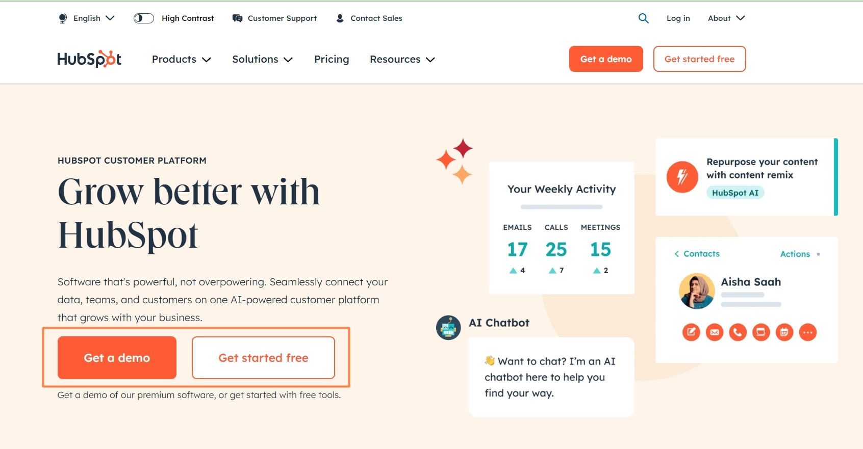
For a comprehensive list of CTAs to inspire you and give you some ideas, check out our blog about 60+ Call to Action Examples!
Concise Content and Well-Designed Layout
The content on your landing page should be concise and focused on guiding the visitor toward the action you want them to take.
Here are some tips to maximize your conversions:
- Use short paragraphs and bullet points to make it easy to read and digest.
- Highlight the key benefits and features of your offer, and use bold or italicized text to draw attention to important points.
- The layout should guide the visitor’s eye naturally through the page.
- Use whitespace effectively to avoid clutter and keep the design clean.
- Break up the text with visual elements, such as images or icons, to maintain interest and engagement.
If your landing page promotes a webinar, your content might include:
- A brief introduction to the webinar topic
- Key takeaways or what participants will learn
- Speaker information and credentials
- Date, time, and duration
- A clear, prominent CTA button like Register Now
Align Your Landing Page with Your Email Campaign
To maximize the effectiveness of your landing page, ensure it aligns seamlessly with your email campaign.
This consistency creates a smooth and cohesive flow for your visitors, increasing their likelihood of staying on the page and taking the desired action.
Here are three main ways to achieve it:
1. Use Consistent Messaging
The messaging on your landing page should mirror the content of your email.
This consistency helps build trust and reassures visitors that they’re in the right place.
Ensure that the design elements—such as colors, fonts, and imagery—are consistent between your email and landing pageClick To Post OnIf your email promises a 20% discount on a product, your landing page should immediately reinforce this offer with a matching headline and details.
Maintaining consistent language, tone, and style is more engaging and trustworthy.
Plus, you avoid any jarring changes that could cause the visitor to go elsewhere and not take the desired action.
2. Personalize for Different Segments of Your Email List
By personalizing the landing page for different segments of your email list, ensuring it speaks to their specific needs and interests, you can significantly boost your conversion rates.
If you have segmented your email list by customer type—such as new customers versus returning customers—you can create customized landing pages for each group.
- A landing page for new customers might focus on introducing your brand and offering a first-time purchase discount
- A page for returning customers could highlight loyalty rewards or new product arrivals.
In helping your visitors feel valued and better understood with messaging that resonates more strongly with them, you increase the likelihood they will take the desired action.
3. Aim for a Visually-Cohesive Experience
Think of your email campaign and landing page as parts of a single story:
- The email sets the stage
- The landing page continues the narrative, leading the visitor towards the final act: conversion.
For a visually-cohesive, seamless experience, ensure that the design elements—such as colors, fonts, and imagery—are consistent between your email and landing page.
This visual harmony enhances the visitor’s experience, makes them feel safe, enhances their sense of trust in your brand, and helps grow your conversions.
Consider an email campaign promoting a free trial for a new software tool.
The email might include a brief introduction to the tool, a few key benefits, and a Start Your Free Trial button.
When the recipient clicks the button, they should land on a page that:
- Welcomes them with a headline like Start Your Free Trial of [Tool Name] Today!
- Provides a quick overview of the tool’s features and benefits, mirroring the email content
- Includes a CTA button that stands out, such as Sign Up for Free
- Has a clean, visually appealing design consistent with the email’s look and feel
By aligning your landing page with your email campaign in these ways, you ensure a seamless, engaging experience that guides visitors smoothly from the email to taking action, ultimately boosting your conversion rates and achieving your marketing goals.
Top Optimization Strategies to Maximize Your Conversions
Optimizing your landing page is crucial for maximizing conversions from your email marketing campaigns.
Here are four main strategies to ensure your landing page performs at its best:
1. Maximize Speed and Accessibility
A fast-loading landing page is essential.
Slow pages can lead to high bounce rates, as visitors are quick to abandon a site that takes too long to load.
Remember too to ensure your landing page is accessible on all devices, especially mobile, as a significant portion of emails are opened on smartphones and tablets.
Use a responsive design that adapts to different screen sizes and test your page across various devices and browsers to ensure it looks and functions perfectly everywhere.
2. Incorporate Trust Signals
Including trust signals on your landing page can significantly increase conversions by reassuring visitors that your offer is legitimate and valuable. Here are some trust signals to consider:
A landing page promoting a software tool could include customer reviews highlighting the tool’s benefits, a security badge ensuring safe transactions, and a statement offering a 30-day money-back guarantee.
3. Adopt SEO Practices
While the primary aim of a landing page is to convert email traffic, optimizing it for search engines can bring in additional, organic traffic.
Here are some SEO best practices:
A landing page about a digital marketing eBook, might include keywords like “digital marketing guide,” “free marketing eBook,” and “marketing strategies” throughout the page.
4. Use Continuous Testing and Optimization
Optimizing your landing page is a continuous process.
By continuously A/B testing your landing page, you can determine over time what drives the best results.
Test different versions of headlines, CTAs, images, and other elements to see what resonates best with your audience—test continuously to see what drives the best results.
You might run an A/B test on two different CTA buttons—one that says “Download Now” and another that says “Get Your Free Guide.”
By tracking which button gets more clicks, you can refine your CTA for better performance.
Remember to test only one element at a time so that you get clear data on what works and what doesn't.
Here's a full guide:
Continuously Analyze and Improve
To ensure your landing page is performing at its best, it’s crucial to analyze its effectiveness and continuously make improvements.
Here’s how you can do that…
Use Appropriate Analytics Tools
Utilizing the right tools can help you gather detailed data and insights about your landing page performance.
Here are some tools you might like to consider:
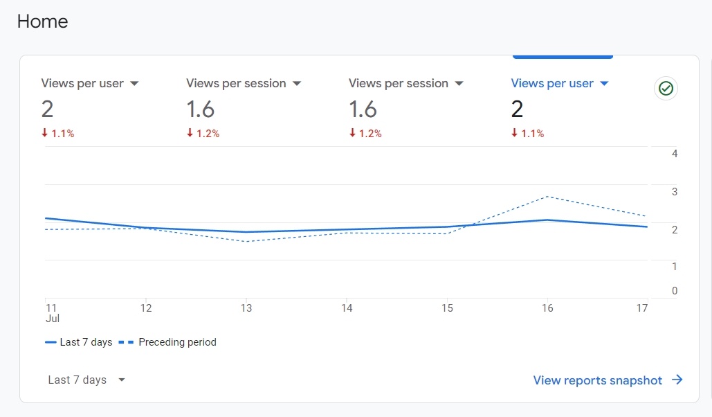
- Google Analytics—this is a comprehensive tool for tracking visitor behavior, bounce rates, conversion rates, and other critical metrics. It can also help you understand where your traffic is coming from and how visitors are interacting with your page.
- Hotjar—offers heatmaps, session recordings, and visitor feedback tools. Heatmaps show you where visitors are clicking, scrolling, and spending the most time, helping you understand what’s working and what’s not.
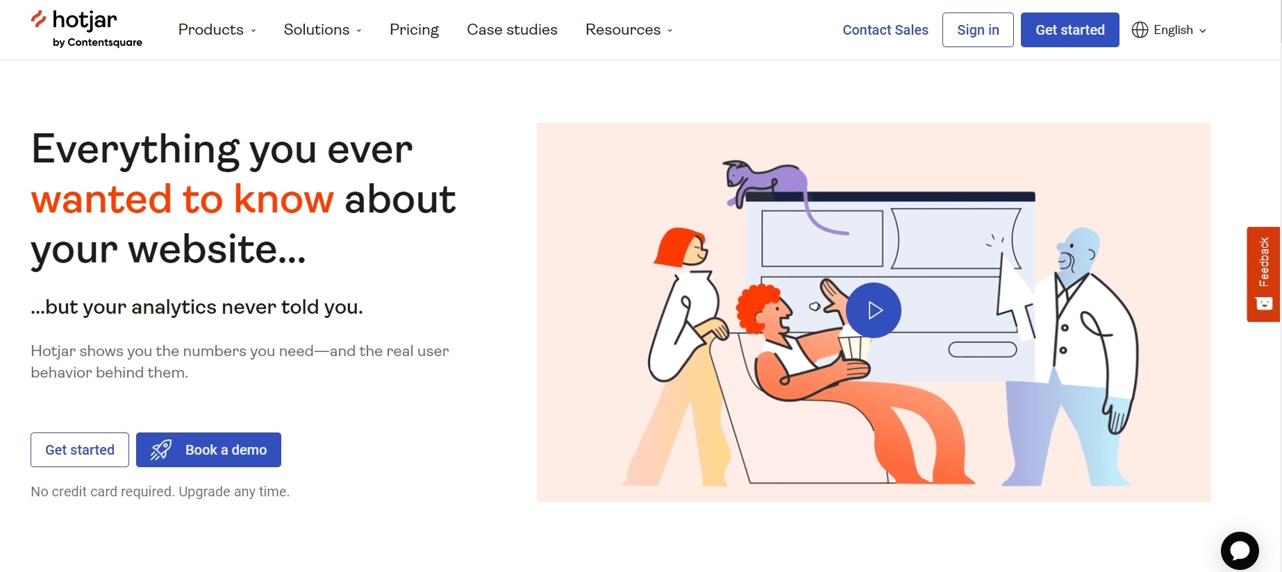
- Crazy Egg—similar to Hotjar, Crazy Egg provides heatmaps and click reports, allowing you to visualize user behavior and make data-driven decisions.
Monitor Key Metrics
Monitoring key performance indicators (KPIs) provides valuable insights into how your landing page is performing. Here are some essential metrics to track:
- Bounce rate—this measures the percentage of visitors who leave your landing page without taking any action. A high bounce rate may indicate that your page isn’t engaging or relevant enough.

- Conversion rate—this tracks the percentage of visitors who complete the desired action, such as signing up for a newsletter or making a purchase. This is one of the most critical metrics for measuring your landing page’s success.
- Time on page—the amount of time visitors spend on your page can indicate how engaging and relevant your content is. Longer time on page typically suggests that visitors are finding value in your content.
- Click-through rate (CTR)—for CTAs and links on your landing page, the CTR shows how effective your call-to-actions are in driving visitors to the next step.
Constantly Make Iterative Improvements
Improving your landing page should be an ongoing process. Based on the data you gather from your analysis tools, continuously refine and optimize your page.
Here are some strategies for iterative improvement:
- A/B testing—as already discussed, regularly test different elements of your landing page, such as headlines, images, CTAs, and layout. By comparing different versions, you can identify which elements drive better performance.
- User feedback—collect feedback from users through surveys or direct questions. Understanding their experience can provide valuable insights into what’s working and what needs improvement.
- Content updates—keep your content fresh and relevant. Update your landing page with new information, testimonials, or offers to maintain visitor interest and engagement.
Frequently Asked Questions
What is a landing page?
A landing page is a dedicated web page designed to convert visitors from email campaigns into leads or customers by focusing on a specific action.
What are the benefits of using dedicated landing pages?
Dedicated landing pages offer benefits like targeted messaging, better tracking, reduced distractions, improved SEO, and the ability to test and optimize.
How can I create an effective call to action (CTA) on a landing page?
Create a compelling CTA by ensuring clarity, visibility, relevance, and using action-oriented language like 'Get Your Free Trial' or 'Download Now.'
How can I align my landing page with my email campaign for maximum effectiveness?
Maintain consistent messaging, personalize for different email segments, and aim for a visually-cohesive experience to guide visitors smoothly through conversion.
What are key optimization strategies for maximizing conversions on a landing page?
Maximize speed, incorporate trust signals, adopt SEO practices, and continuously test and optimize elements like headlines, CTAs, and images.
To Conclude
Creating an effective landing page involves a combination of compelling headlines, engaging visuals, clear CTAs, and ensuring message consistency with your email campaigns
By personalizing the experience for different audience segments, optimizing for speed and accessibility, and continuously analyzing performance, you can significantly boost your conversion rates.
Remember, the key to a successful landing page is continuous improvement.
Use the data and feedback from your analysis tools to make informed adjustments, test different elements, and refine your approach.
Implement these strategies in your next email campaign and see your conversions grow.
