“The money's in the list,” right?
But getting visitors to sign up can be challenging.
With overflowing inboxes and all the concerns about privacy, they need a compelling reason...
In other words, an offer so good that they just want what you’ve got, and want to sign up for it now!
But where do you start?
What type of attractive sign-up offer could you make?
Need some inspiration?
That's exactly what this post gives you.
You're about to discover well over 50 creative and effective email sign-up examples, helping to trigger ideas for offers for your own target market.
But remember to test. See what works best for your own market, and continuously test new approaches to try to improve response rates.
Let's go...
50+ Email Sign-Up Examples
1. ClickFunnels
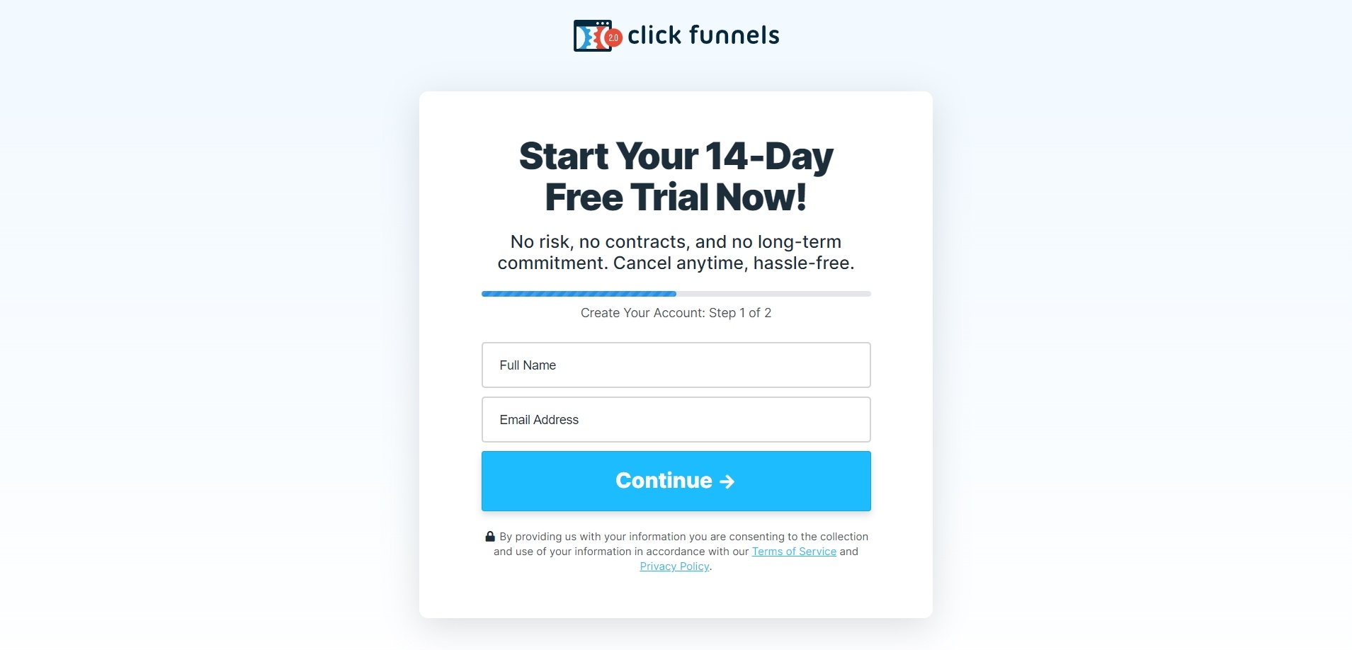
ClickFunnels encourages visitors to provide their email address with the offer of a 14-day free trial.
Note all the elements involved in this box, including:
- A clear headline so visitors know exactly what they’re getting
- Clear risk reversal statements in the sub-headline
- The use of a progress bar so users know what to expect
- The use of a privacy statement (including padlock icon) to build trust
The two-step sign-up process means that even if the user doesn't complete the second step to get their free trial, ClickFunnels can use their email address to follow up and encourage them to take action.
When creating sign-up offers for your list, use examples from others for inspiration. But test and experiment to see what works best for you.Click To Post On2. Xperiencify
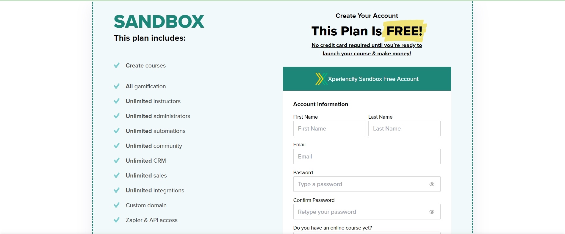
Xperiencify invites users to submit their email address and other information in order to access their software’s Sandbox package.
Note their use of ‘free’, highlighted and capitalized in the title to attract immediate attention, and then repeated in the bar just above the sign-up fields.
In addition, note the list of short and succinct benefit statements on the left-hand side of the sign-up box to make it clear all the value that’s on offer.
While the additional fields in the sign-up box is likely to reduce conversions (as compared to just name and email), this approach can help to pre-qualify those who sign-up, thereby improving list quality and reducing tyre kickers.
3. Metadata
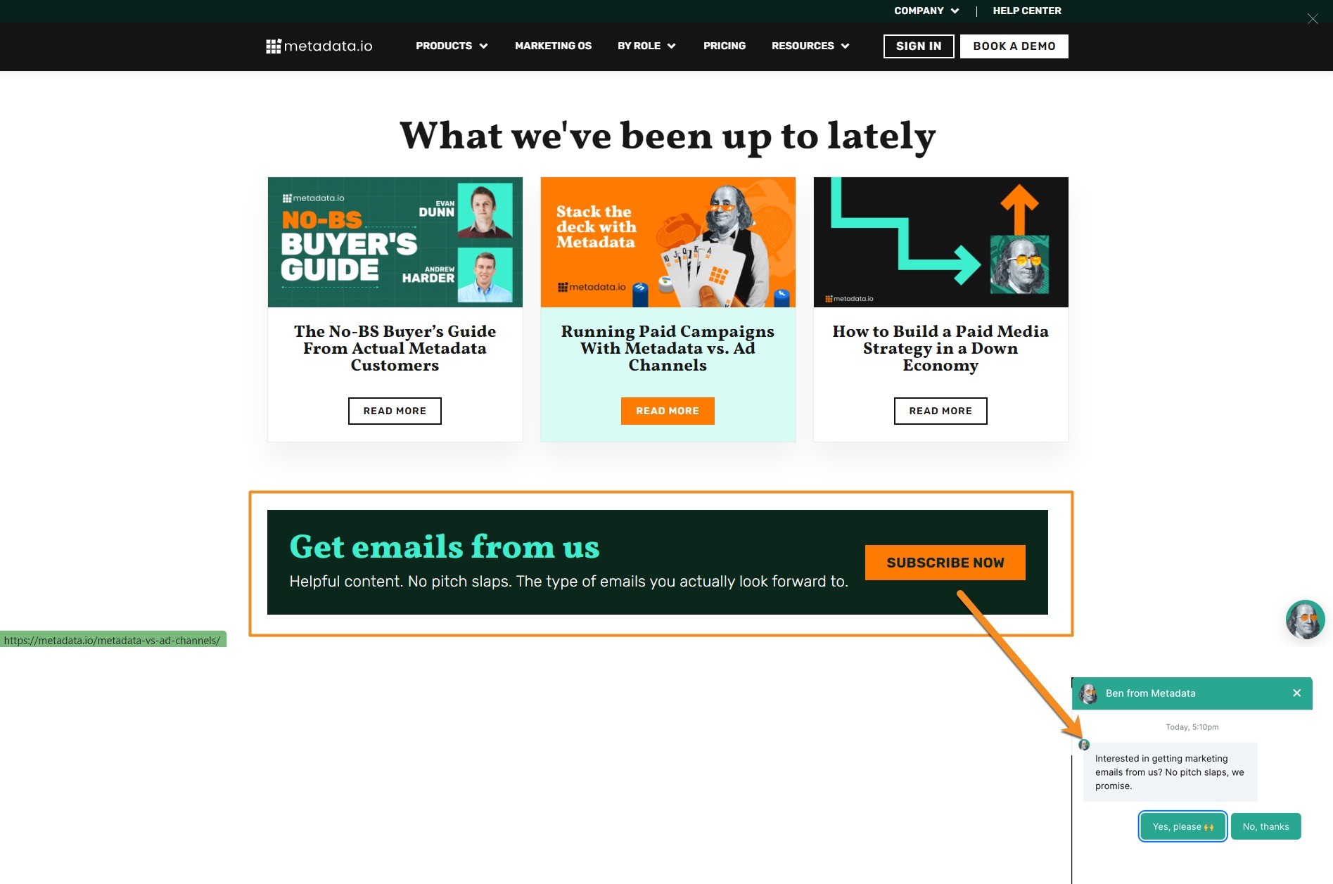
Metadata uses a simple offer to start getting emails from them, with a Subscribe Now button that opens a chat box rather than the more typical email sign-up popup.
Have a look at the copy they use, where they build trust and relay benefits by assuring potential subscribers that the emails they receive will be helpful and free of pitches, and be something they look forward to receiving.
Increase conversions for email sign-up offers by providing clear benefit statements. Remove any doubt by making it obvious what's in it for them.Click To Post On4. Zoom.US
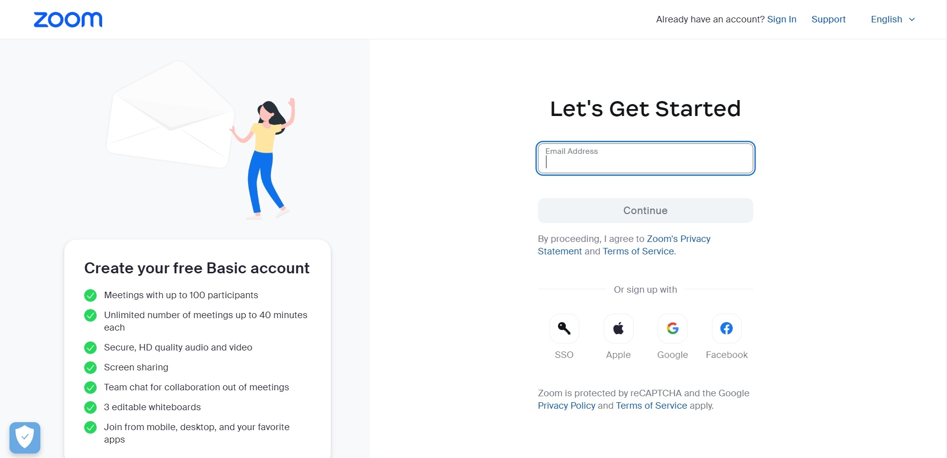
Zoom keeps it super simple with the offer of a free Basic account in return for just an email address, with other steps to follow.
As with ClickFunnels above, the use of the Continue button indicates there’ll be one or more additional steps, but requesting an email first means Zoom can immediately start following up regardless of whether or not the user completes the process.
Notice again the list of benefits on the left-hand side of the sign-up box.
5. ImpactPlus
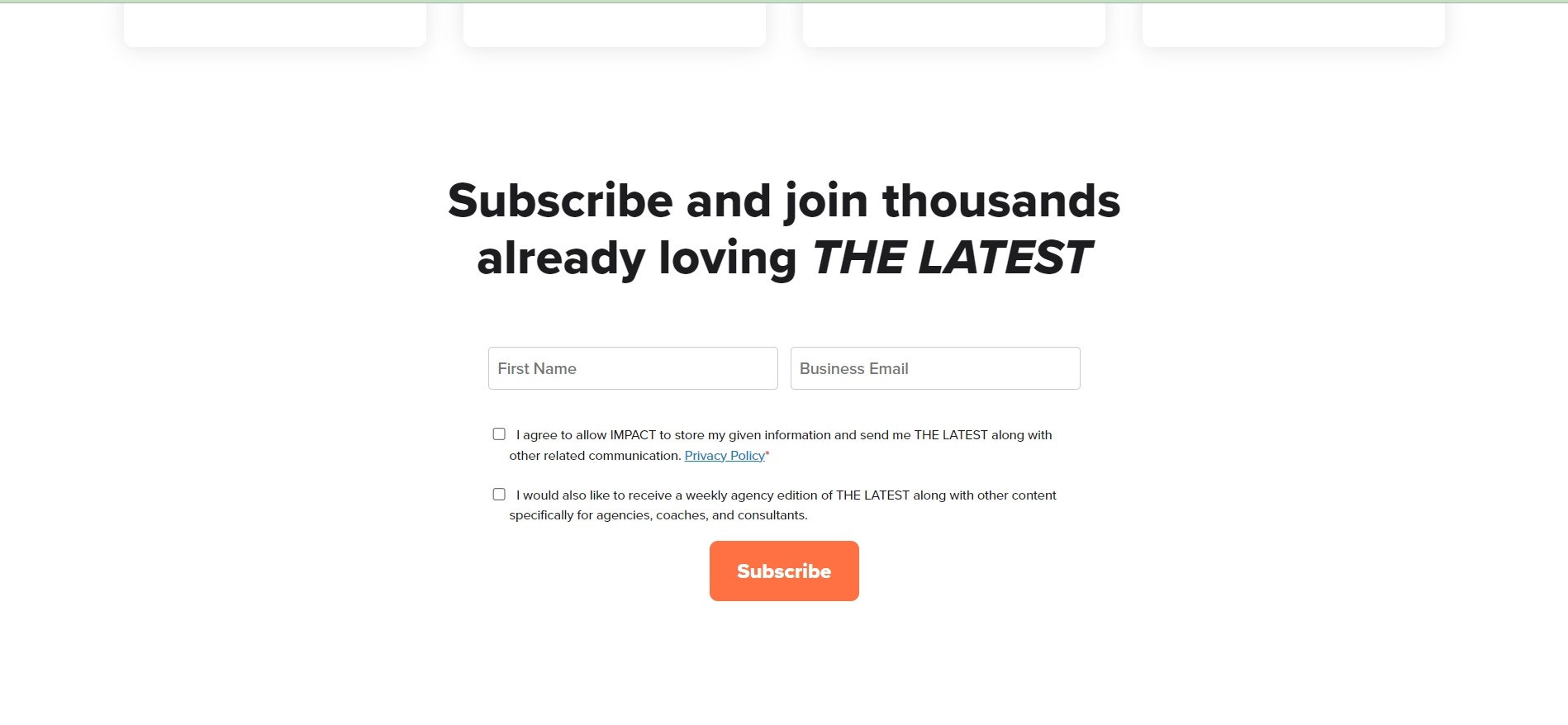
ImpactPlus offers their newsletter, including social proof in their headline to encourage others to do the same.
They specifically request the user’s business email address, making it clear who they’re targeting and likely improving deliverability and response rates.
6. MailerLite
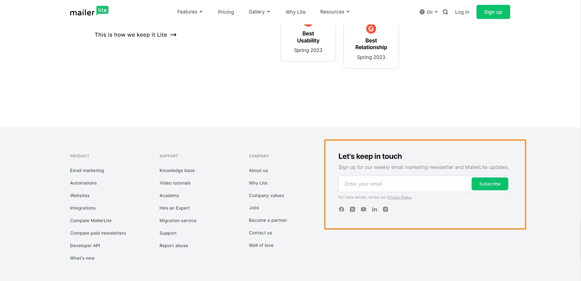
MailerLite has a simple offer for visitors to ‘keep in touch’ and receive their weekly email marketing newsletter along with other updates.
It’s a simple single-field sign-up box that just requests the user’s email address.
7. ConvertKit
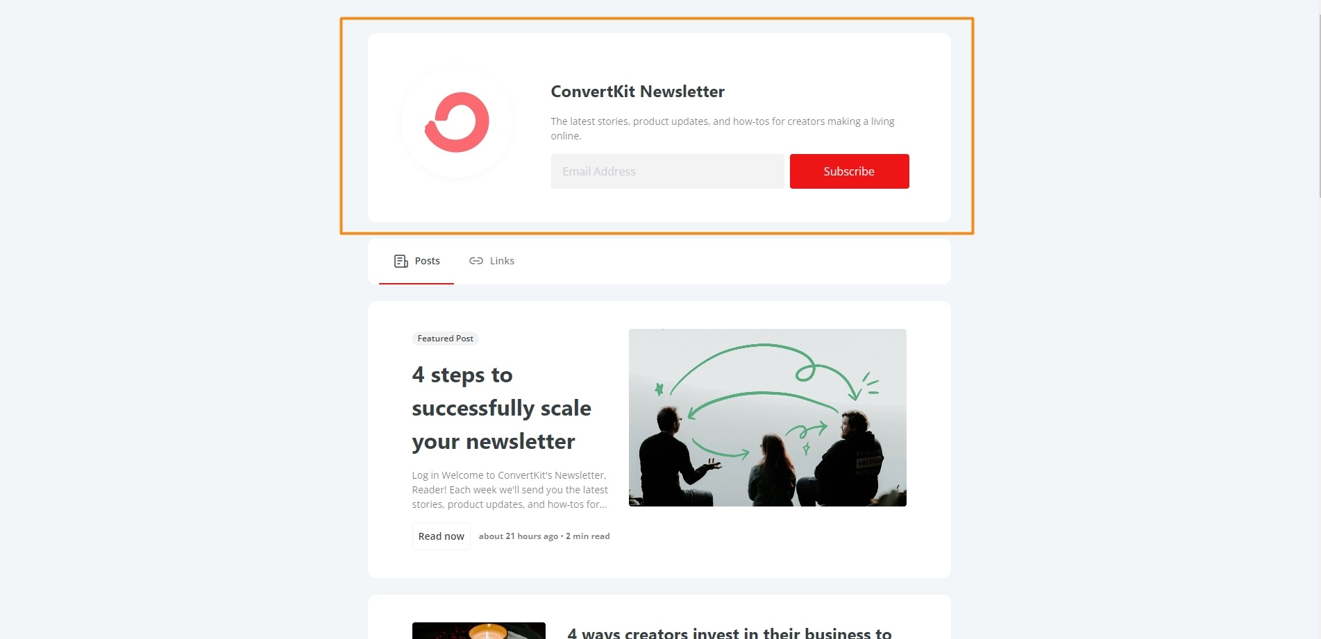
This sign-up example from ConvertKit's makes another simple newsletter pitch, offering subscribers the ‘latest stories, product updates, and how-tos for creators making a living online’.
Again, it’s a single field sign-up box with a subscribe button.
8. Tony Robbins
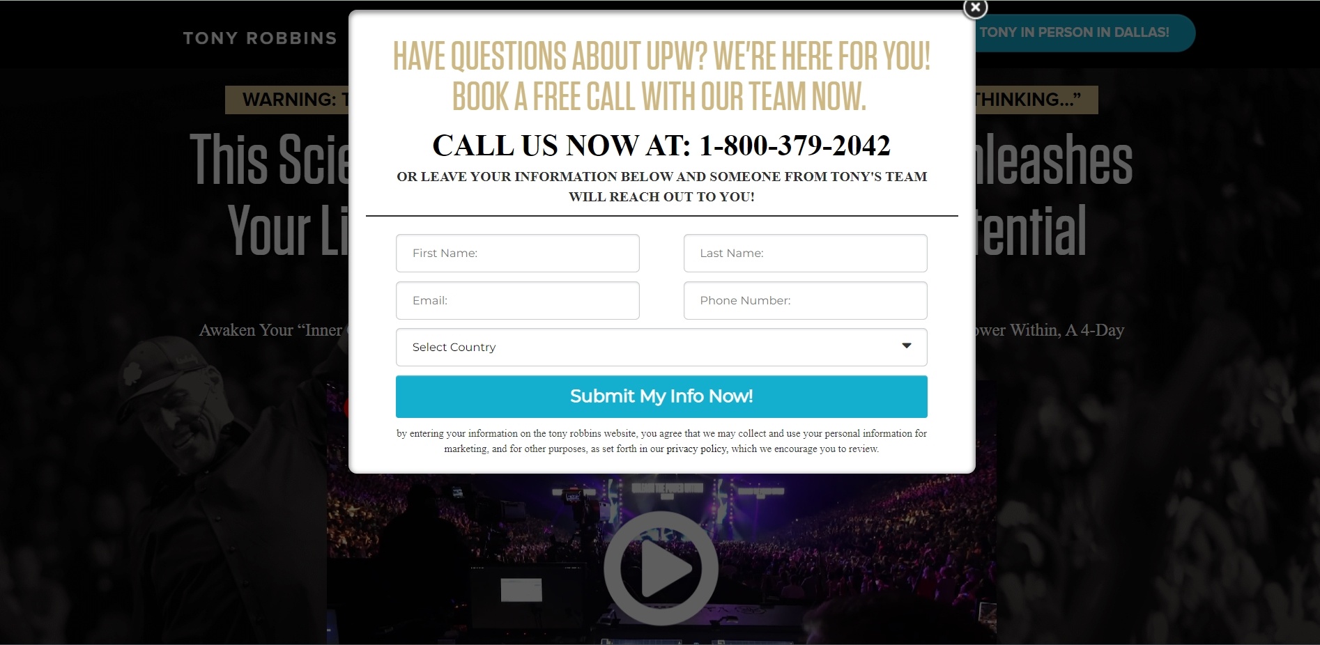
Tony Robbins' team has a dual track approach to attracting leads, offering both a phone number for people to call and the opportunity for visitors to leave their information, in order to find out more about their UPW event.
Note the small print underneath the button that allows them to keep in contact with people who submit their details.
"The money's in the list", right? But getting someone to hand over their email is challenging. Give them such a compelling reason, it dissolves hesitation.Click To Post On9. Gary Vaynerchuk
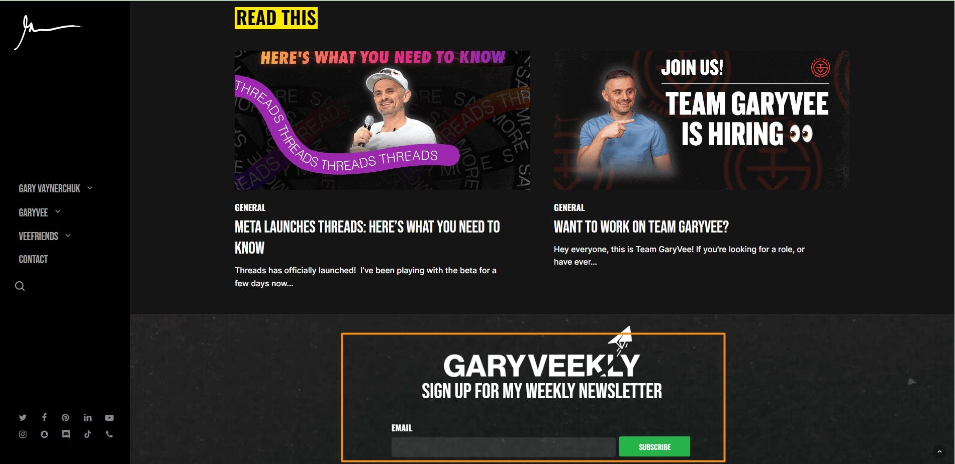
Gary Vaynerchuk makes it very clear what people will get as a result of submitting their email address—his ‘GaryVeekly’ weekly newsletter. Note the clear and short headline, which makes it easy to grasp what’s on offer at a glance.
10. Klaviyo
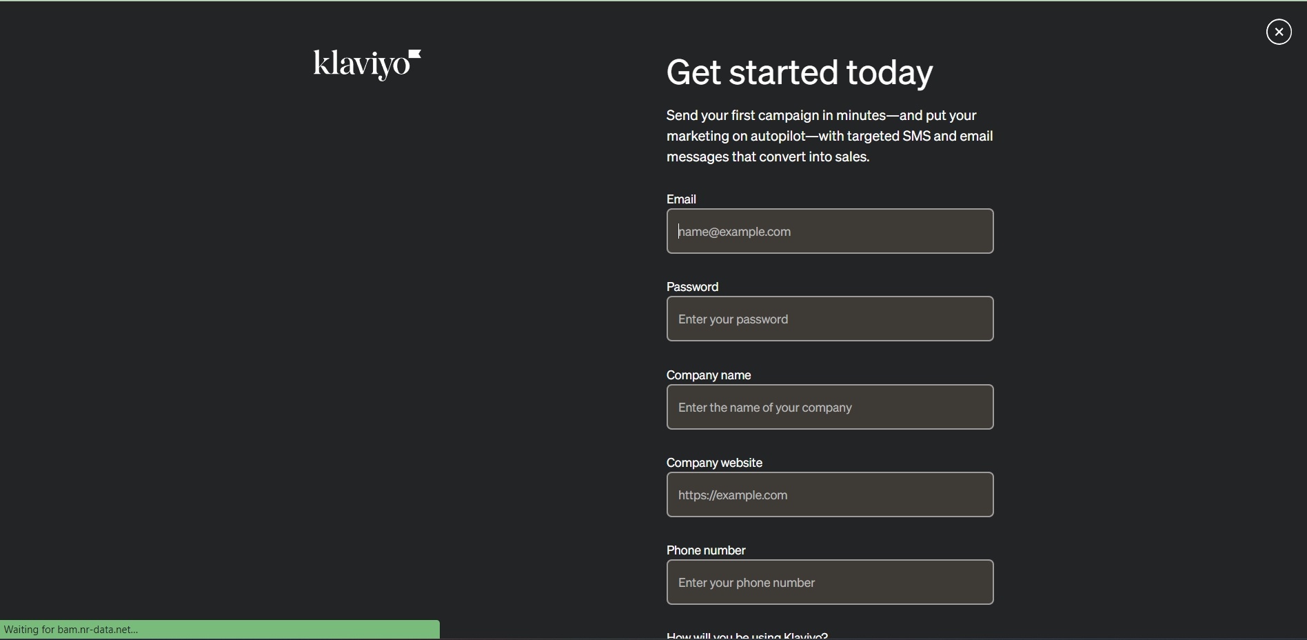
Klaviyo has an offer for visitors to ‘Get started today’ in exchange for their contact details, with the ability for people to start sending their ‘first campaign in minutes’.
Offering free trials and similar is a powerful way for software providers to collect email addresses from interested prospects. The value on offer from using a particular piece of software for free is usually significant..
11. Food Network
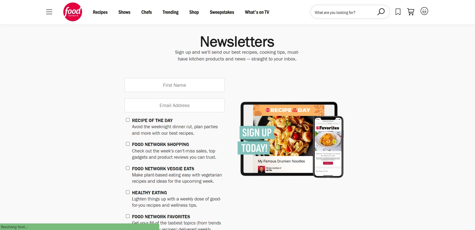
Food Network offers various newsletters to encourage visitors to provide their email address. As long as someone likes food (most people!) they’re likely to find at least one of their newsletters of interest.
Note the use of an effective call to action phrase in the image on the right, Sign Up Today!
12. The Daily Stoic
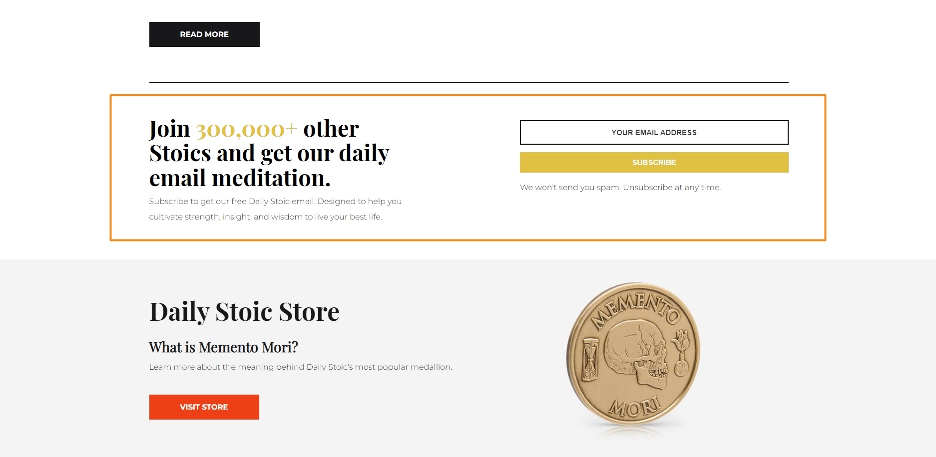
Daily Stoic uses social proof (over 300,000 other subscribers) to encourage visitors to sign up to the list to receive a daily ‘email meditation’.
Notice the subheading which:
- Confirms what someone will receive after signing up
- Clearly states the benefits of doing so, helping subscribers to ‘cultivate strength, insight and wisdom’ to live their best life
13. Shopify
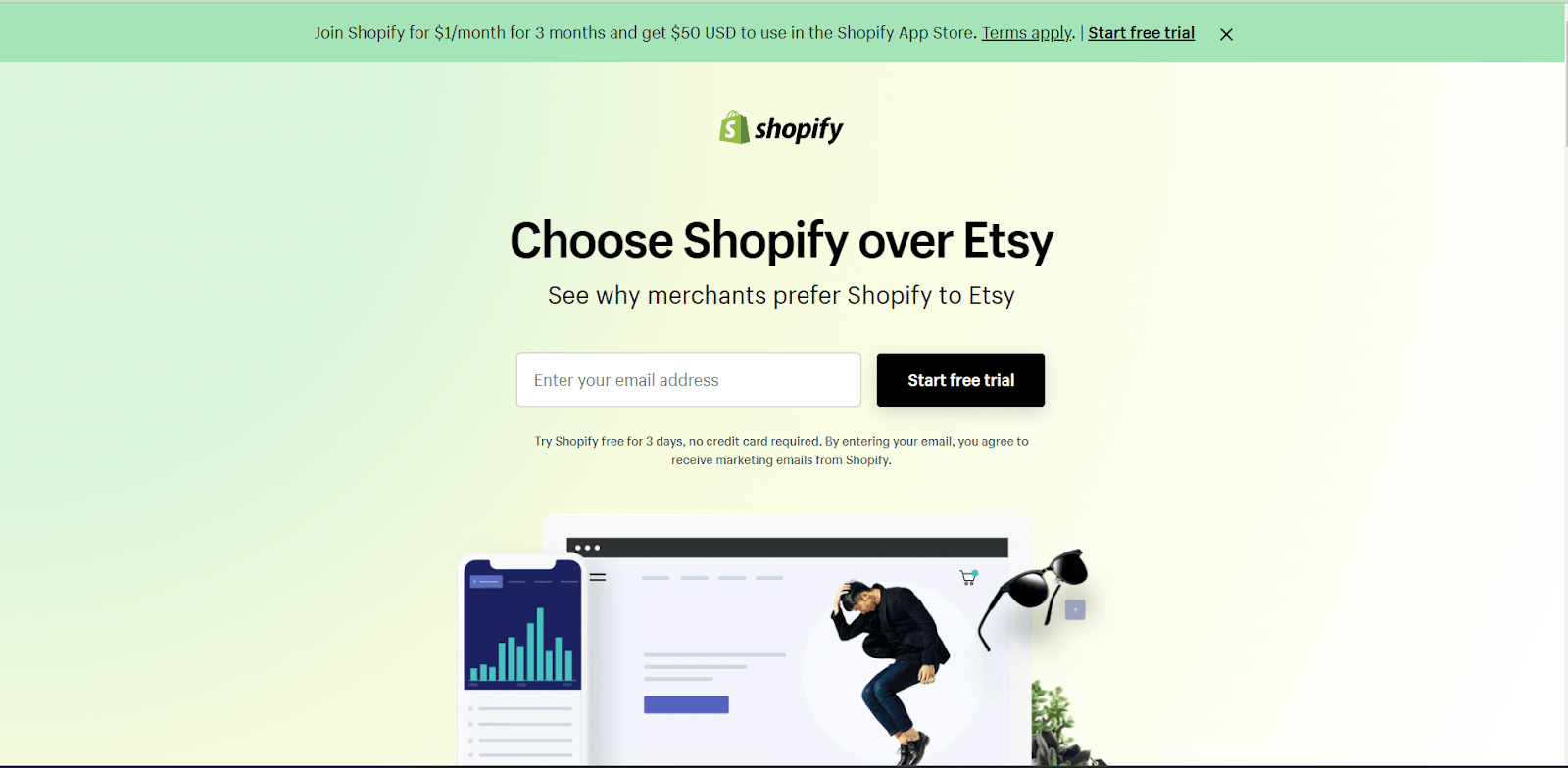
Shopify encourages email sign-ups by challenging users to compare what they provide to Etsy’s selling platform.
Users can try the software for 3 days without needing to enter any credit card information, simply by entering their email address.
Note the small print that makes it clear Shopify will continue to contact them via email.
For an effective sign-up offer for your list, use elements such as a clear headline, risk reversal, social proof, and an unmistakable CTA.Click To Post On14. HubSpot
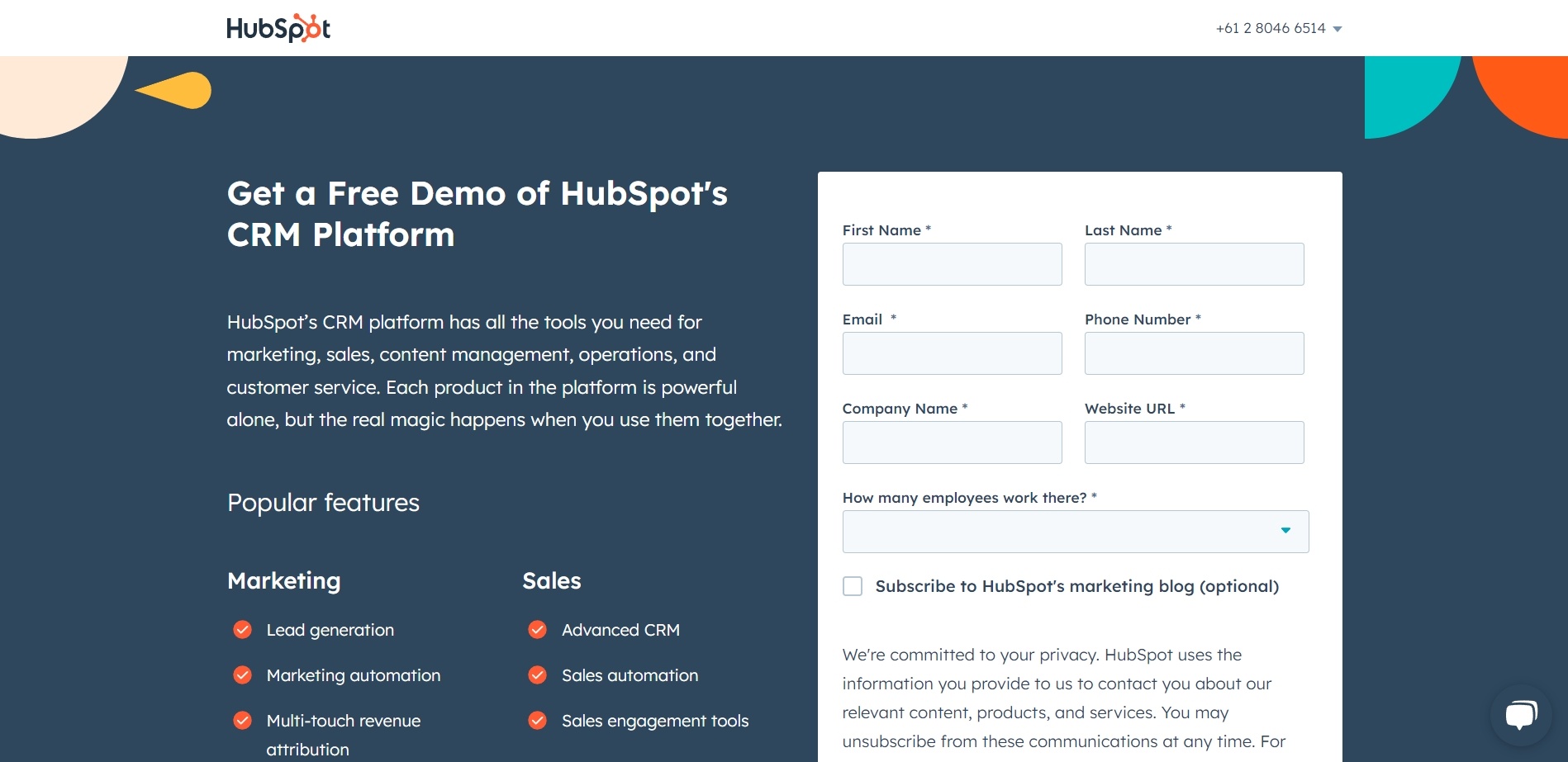
HubSpot clearly wants to qualify anyone signing up for a demo, by having multiple mandatory fields that prospects have to fill in.
This will reduce conversions in terms of prospects they can contact, but helps ensure that the prospects that do sign up are well qualified and serious about their potential use of the software.
Note the additional checkbox people can check to receive emails with content from their blog.
15. Grant Cardone
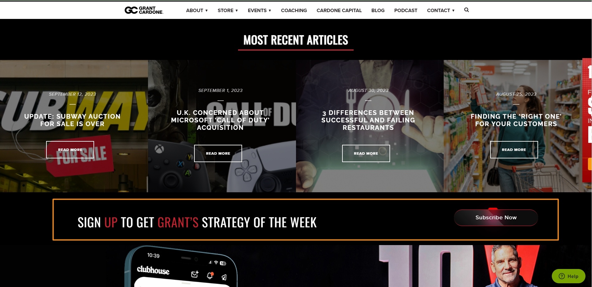
Grant Cardone attracts visitors to share their email address with his 'Strategy of the Week'. With this method, he captures their interest and gathers their contact details. This positions him to interact with them through later communications.
16. Sprout Social
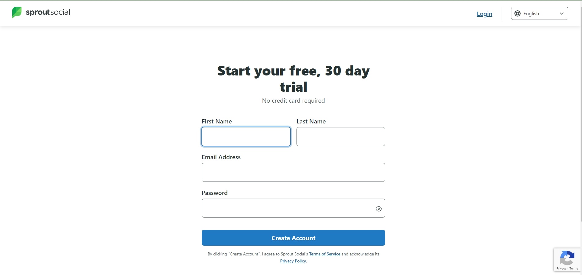
Sprout Social incentivizes visitors to submit their email addresses by offering a 30-day trial. By emphasizing a commitment-free exploration, they aim to lower barriers to entry and increase the likelihood of email signups. This creates a strategy that makes the email capture process appear seamless.
17. Loomly
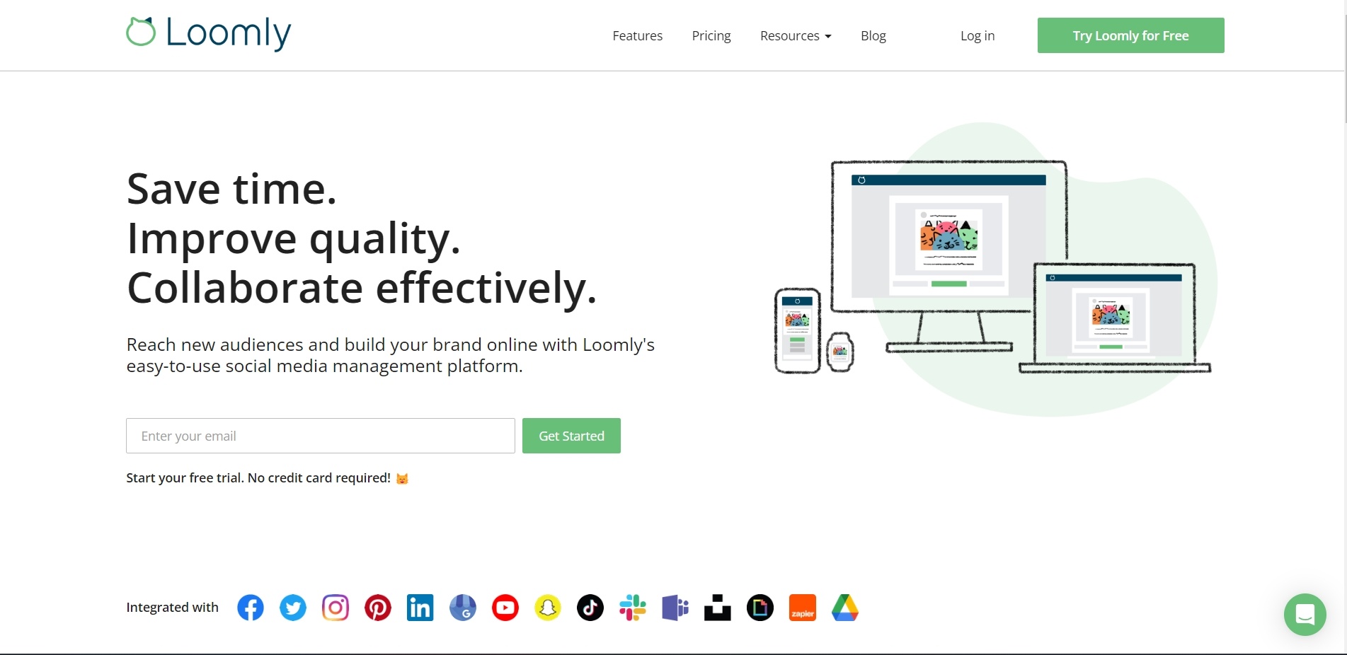
Loomly uses promises of time-saving and quality improvements as strategies to grab attention. Their position to offer free sign-up is also a tactic to simplify conversion. Incorporating a playful emoji is their approach to make the interaction more engaging, intending to boost email signups.
18. Acquisition.com
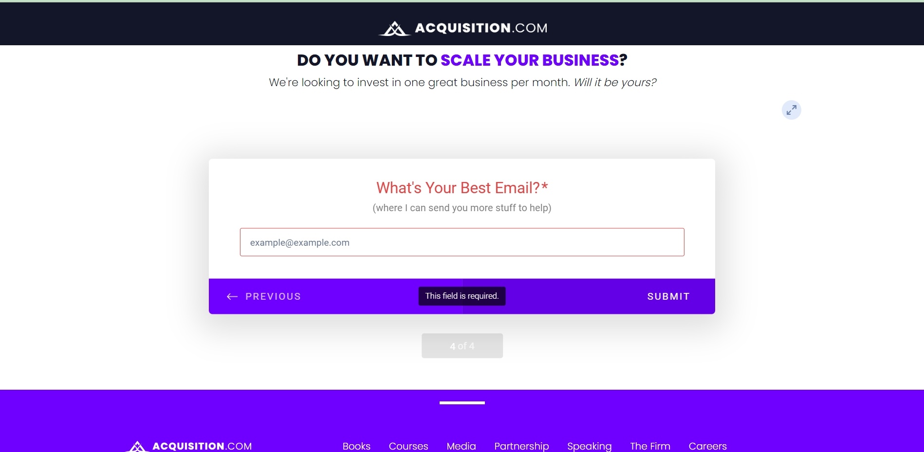
Acquisition.com offers visitors the chance to get more advice on how to scale their business, asking visitors to simply enter their ‘best email’.
Asking for someone’s ‘best email’ discourages visitors from entering a throwaway email for an inbox they rarely look at, and can help boost the quality of the list along with deliverability.
19. DropBox
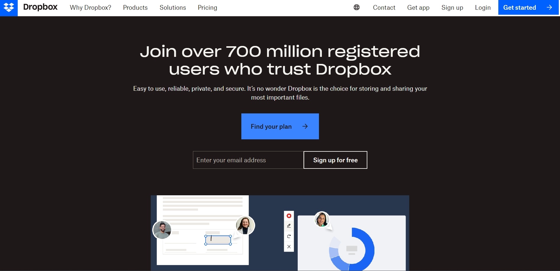
Dropbox has an offer for people to sign up for free, citing their ‘700 million registered users’ as social proof to encourage visitors.
20. MailChimp
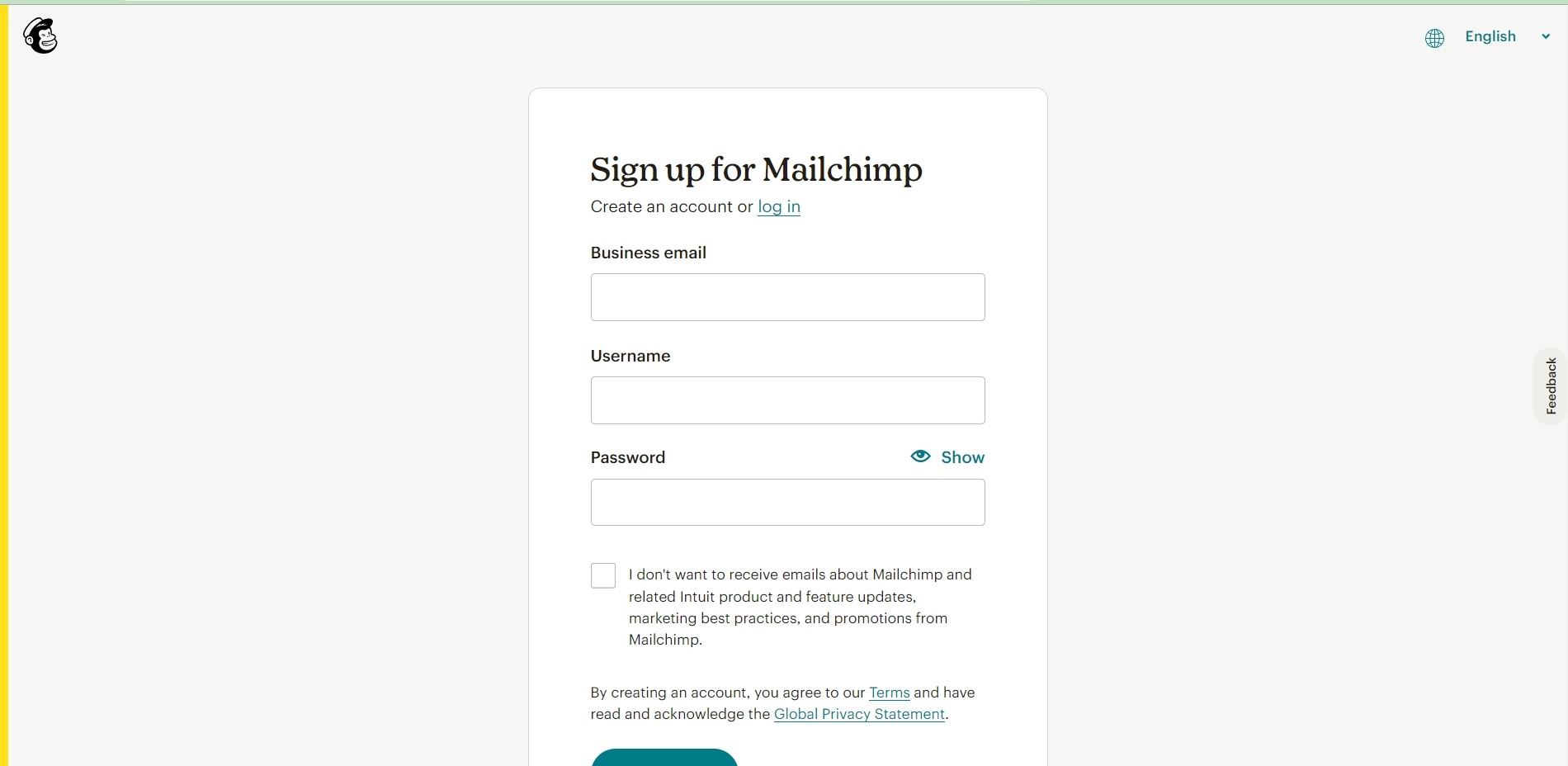
Here’s another example of a free trial sign-up, requesting someone’s Business email address, along with the username and password they want to use.
Note the use of the checkbox, that means Mailchimp will email those who sign up unless they specific check the box to opt out.
21. Better Homes & Gardens
22. Brandmuscle
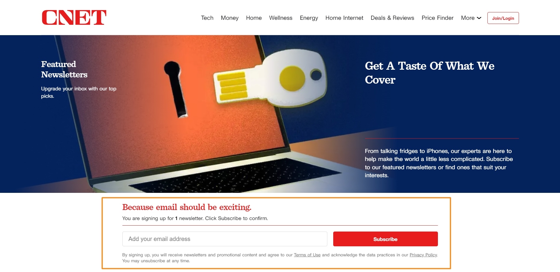
23. CNET
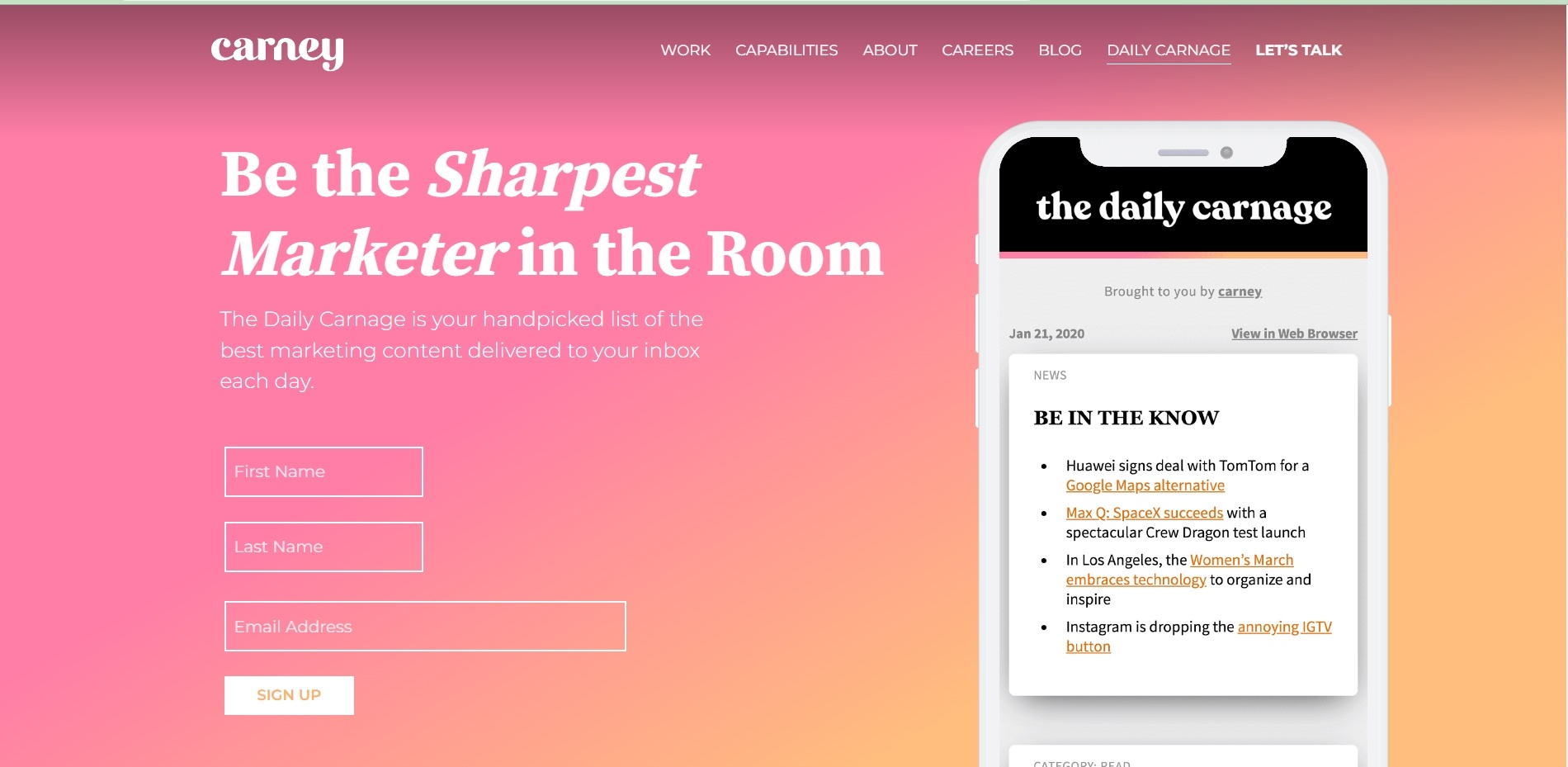
23. Carney
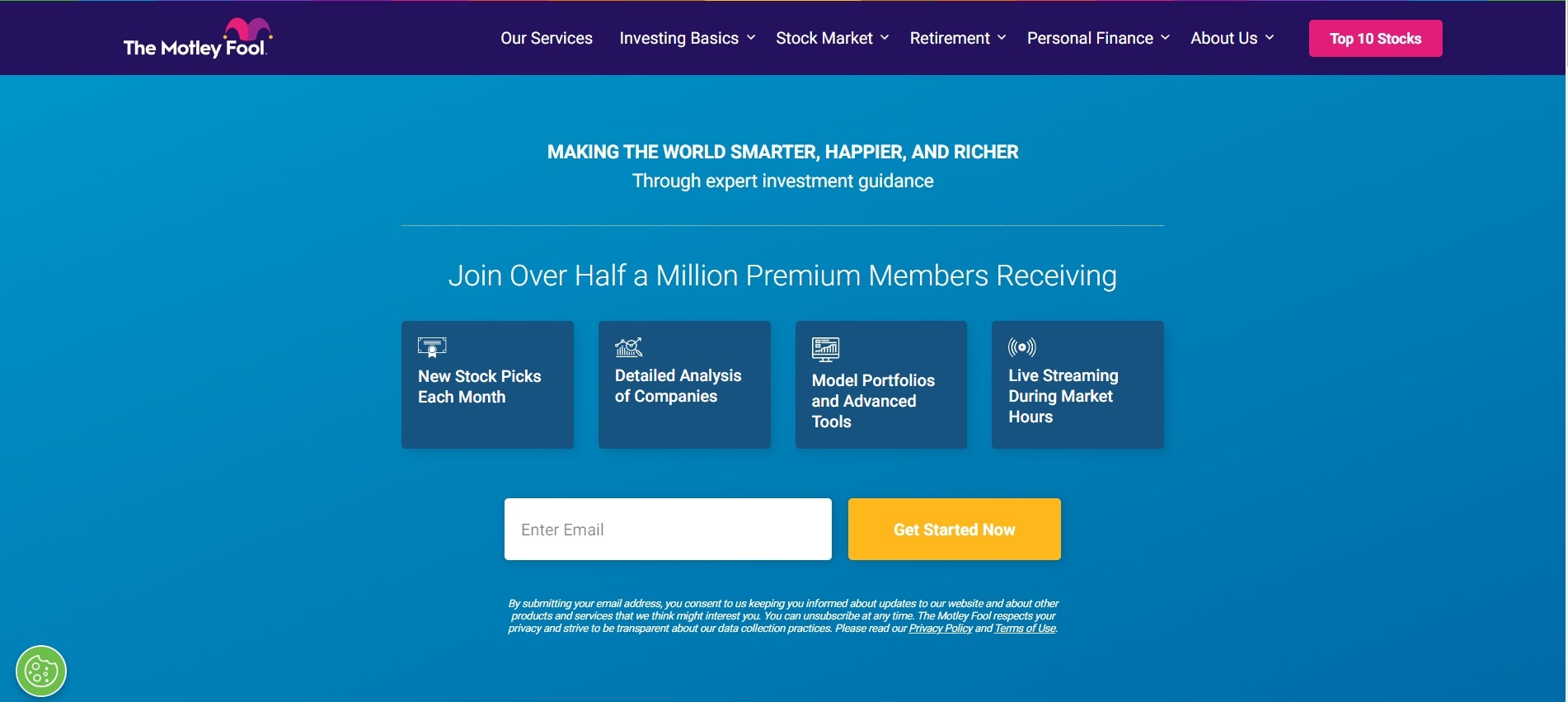
24. The Motley Fool
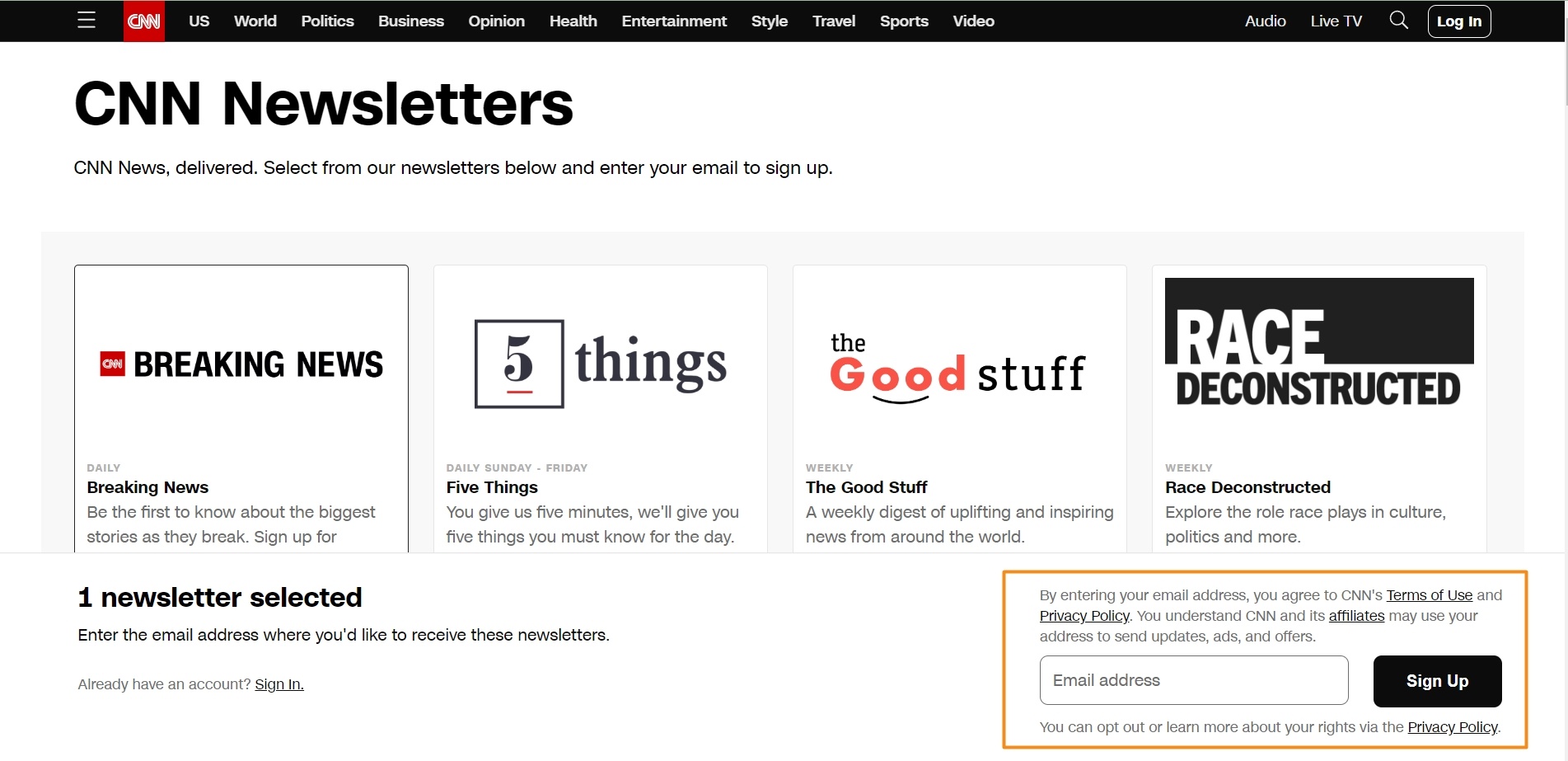
25. CNN
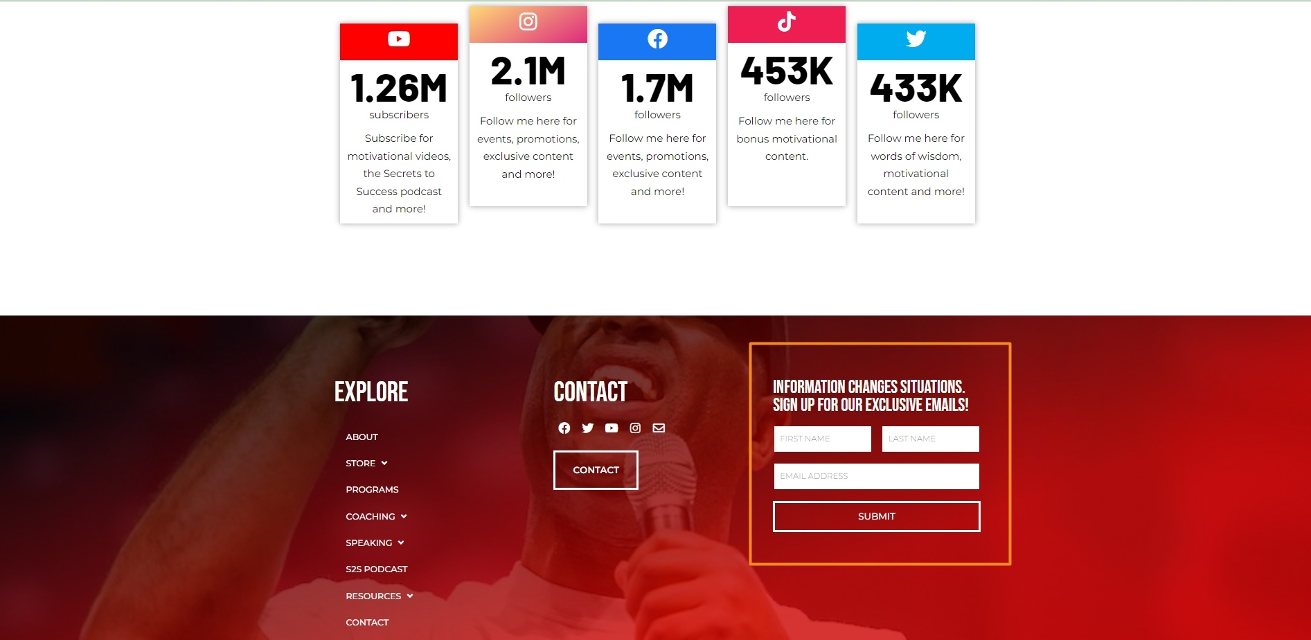
25. Eric Thomas
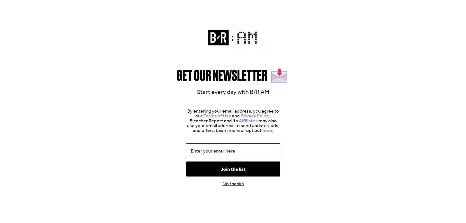
26. Bleacher Report
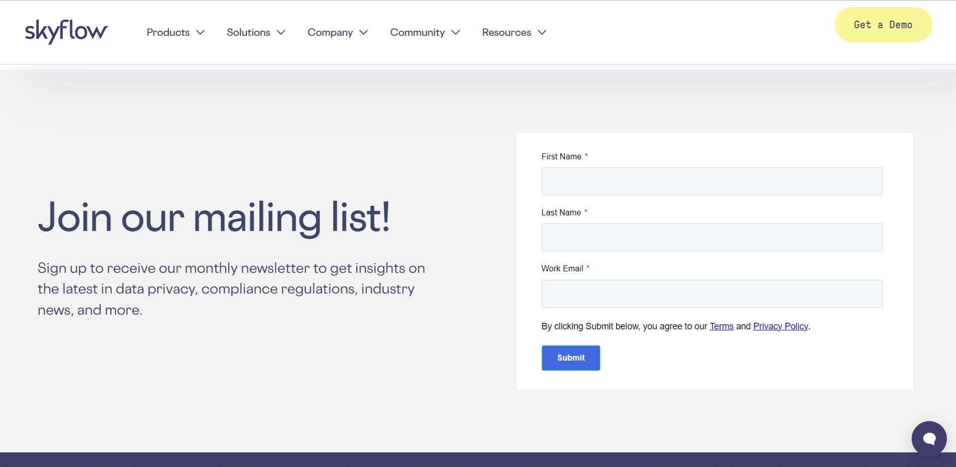
27. SkyFlow
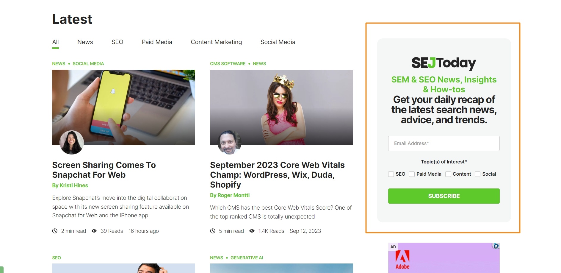
28. Search Engine Journal
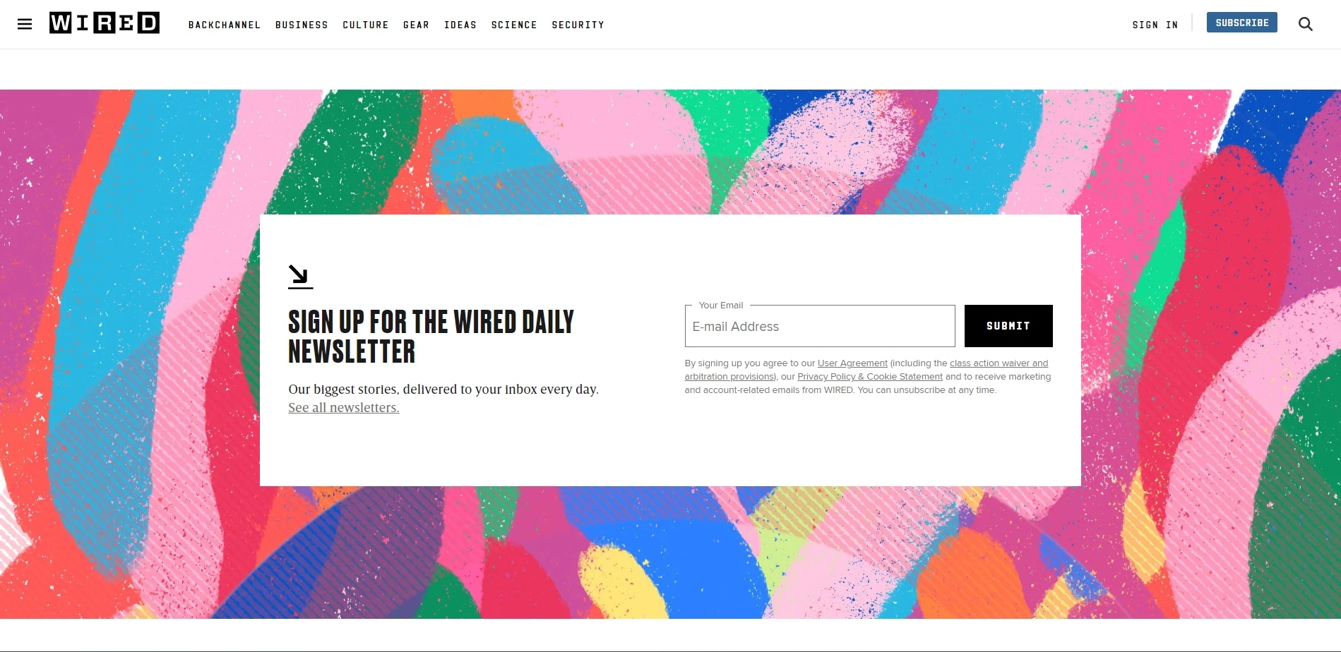
29. Wired
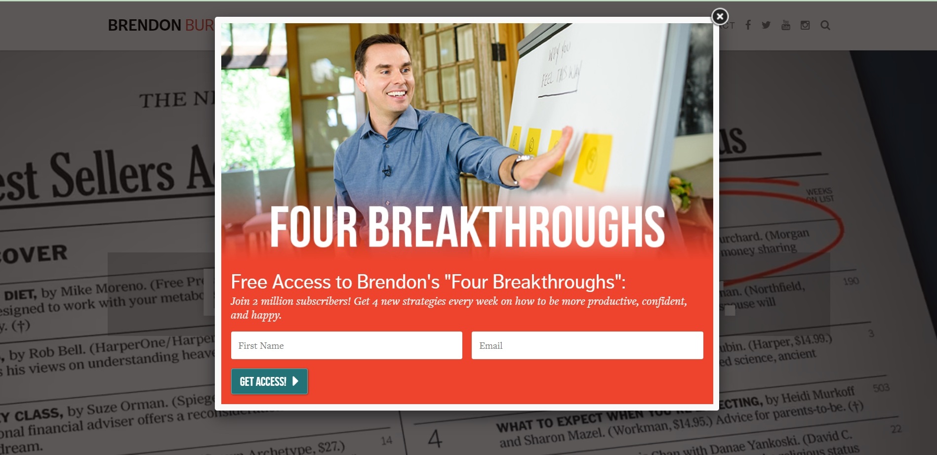
30. Brendon
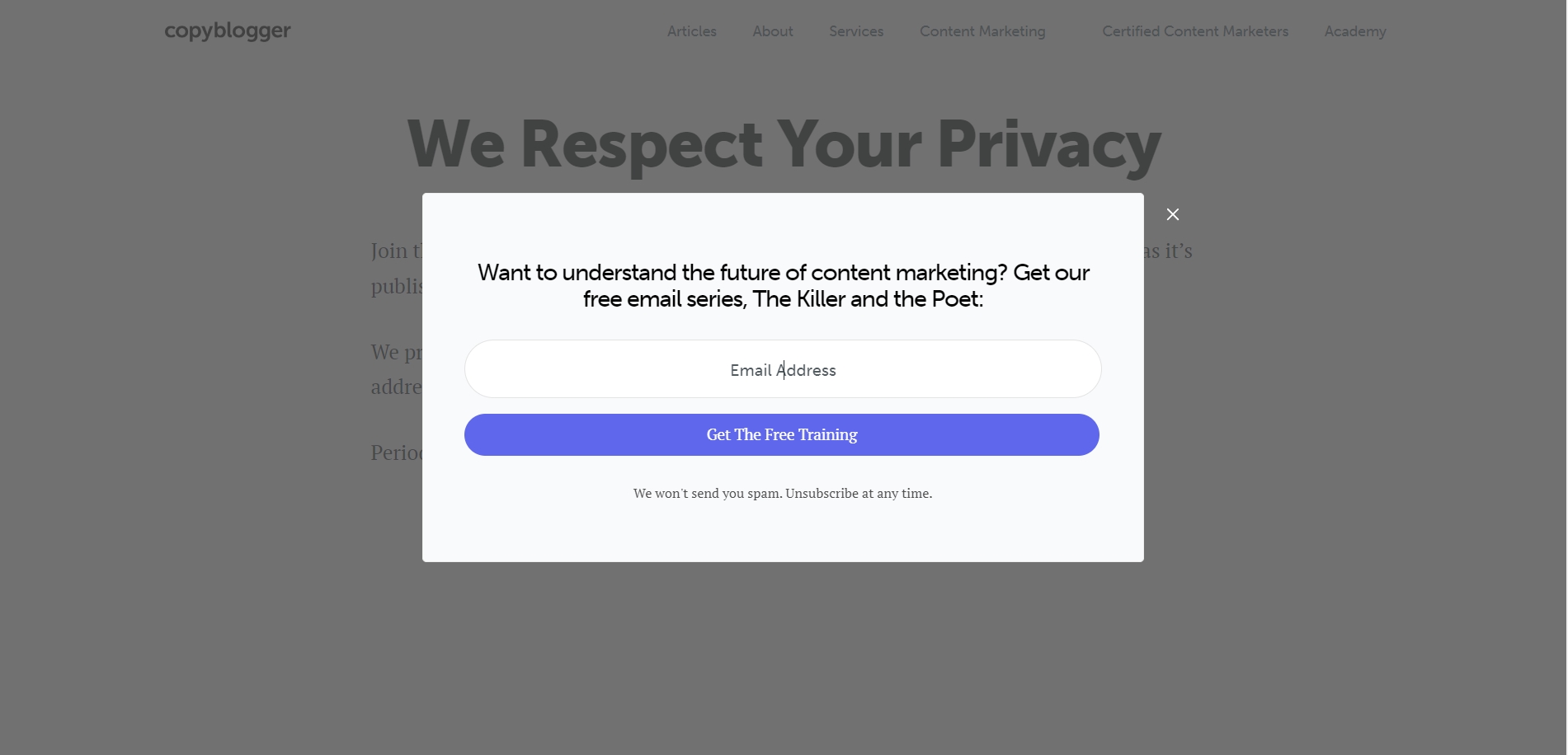
31. Copyblogger
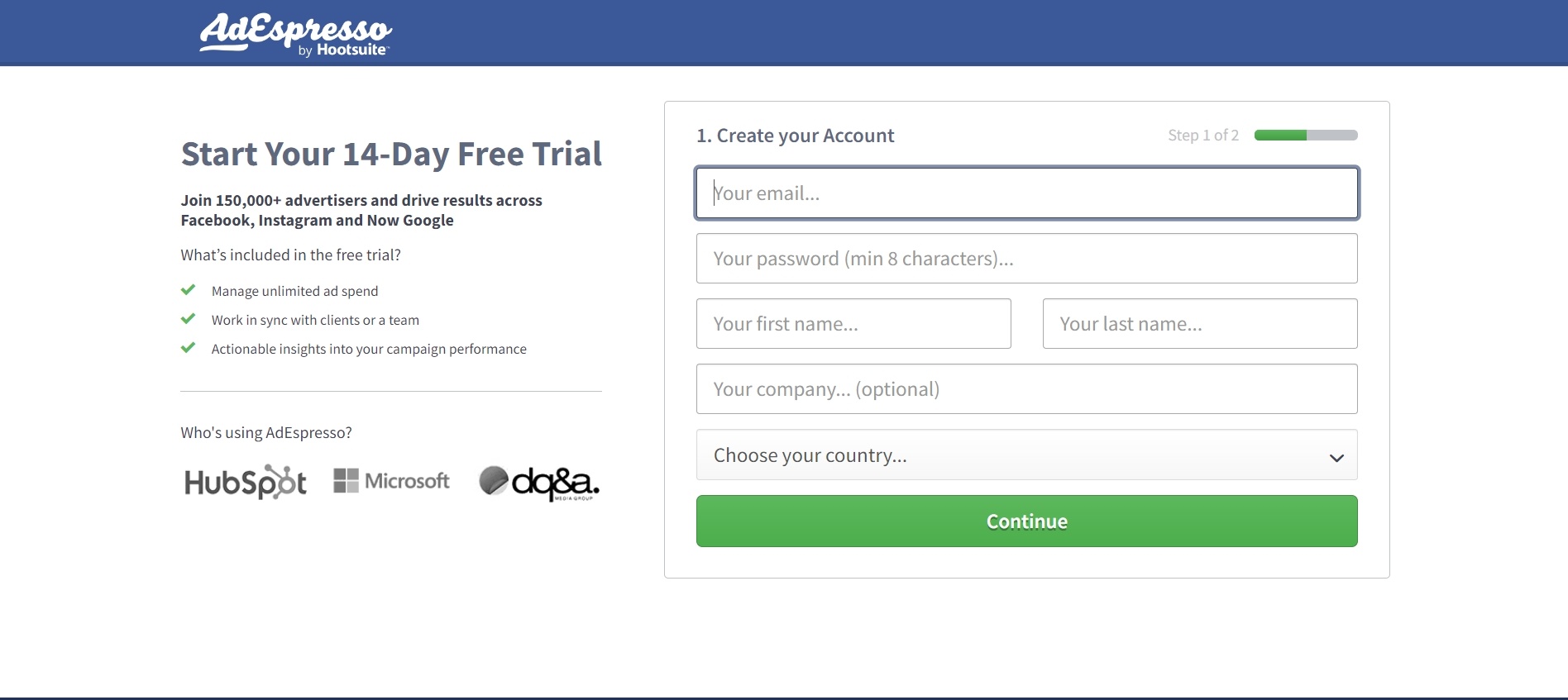
32. AdEspresso
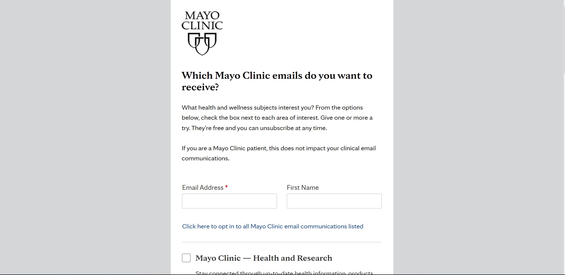
33. MAYO Clinic
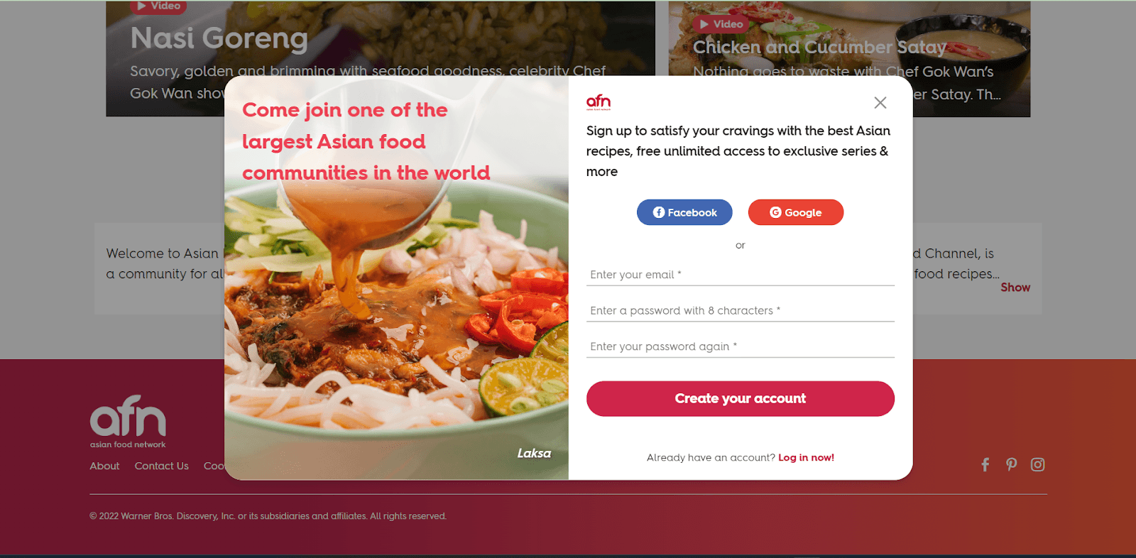
34. Asian Food Network
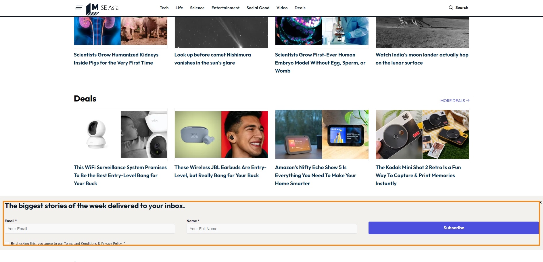
35. Mashable SEA
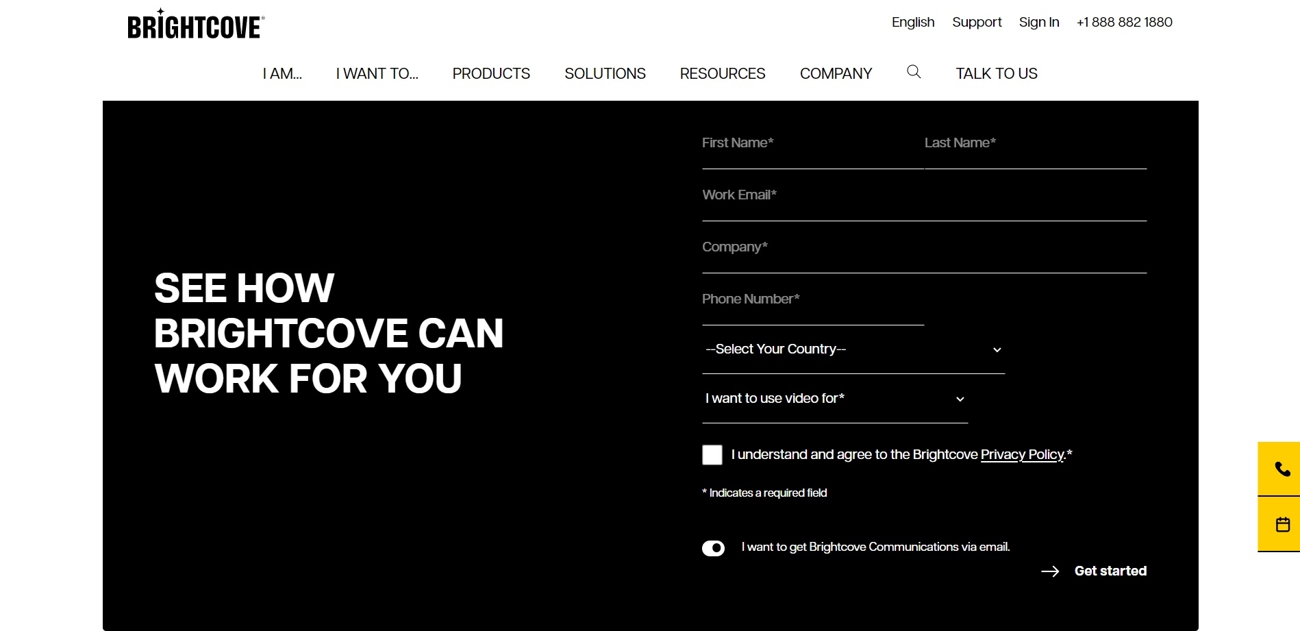
36. BrightCove
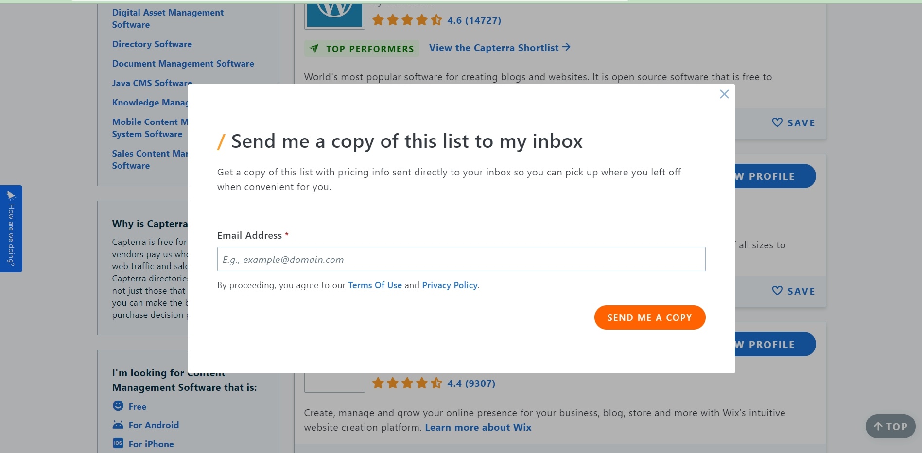
37. Capterra
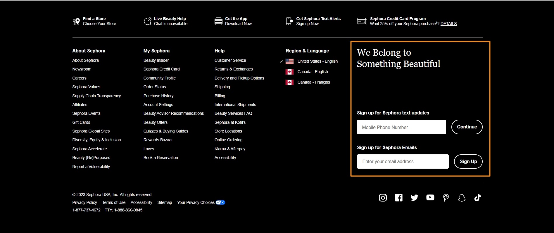
38. Sephora
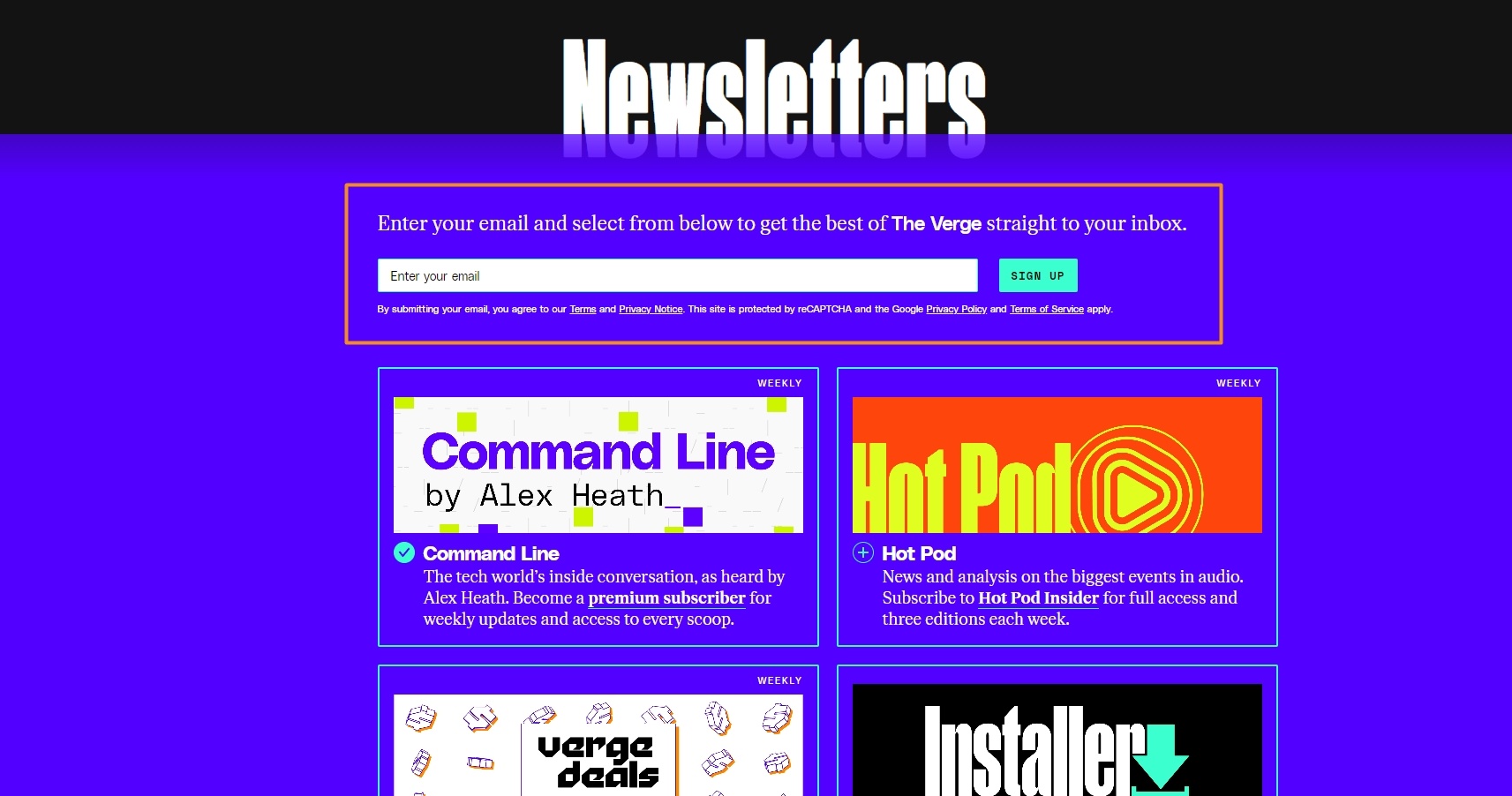
39. The Verge
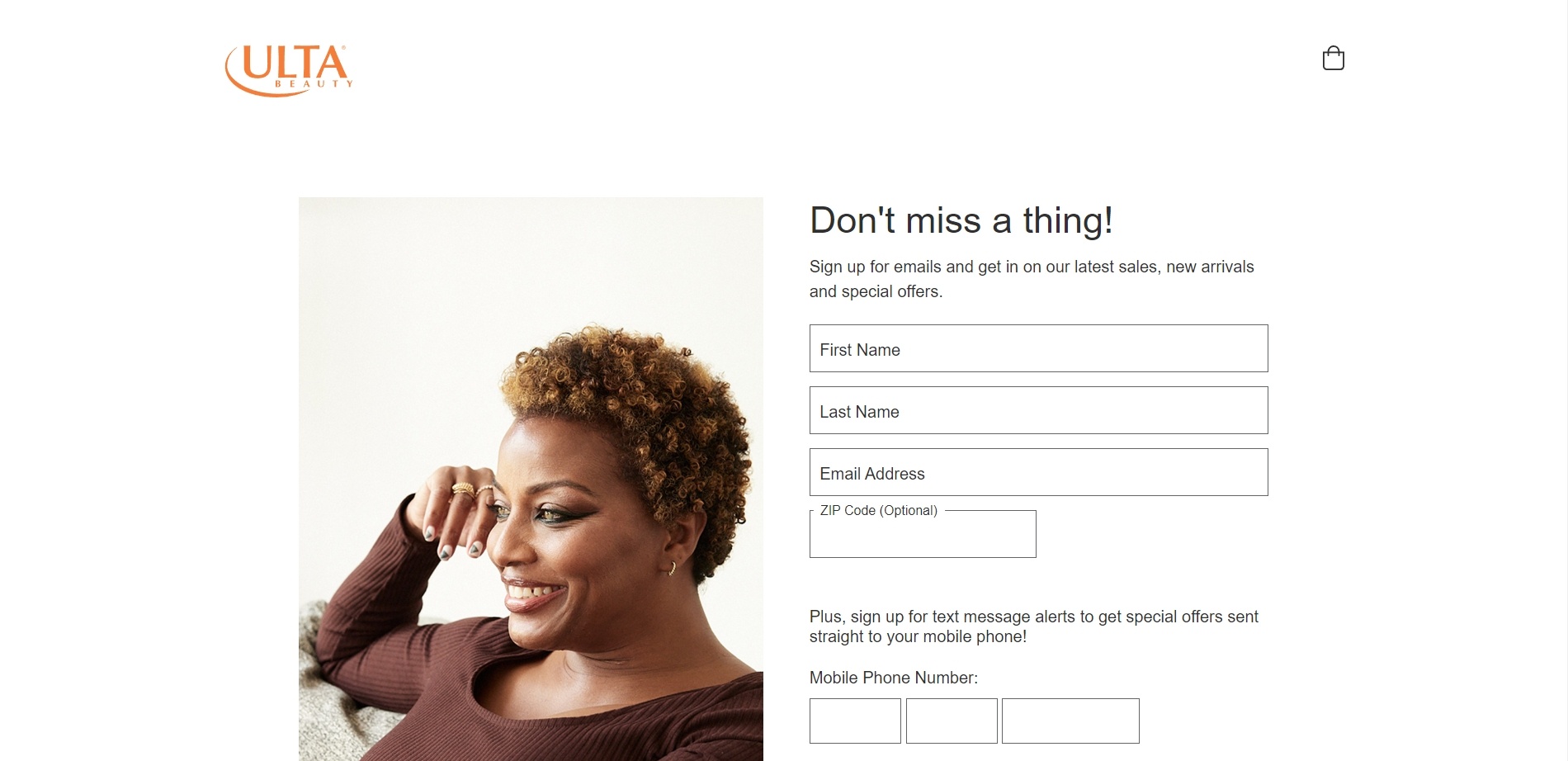
40. Ulta Beauty
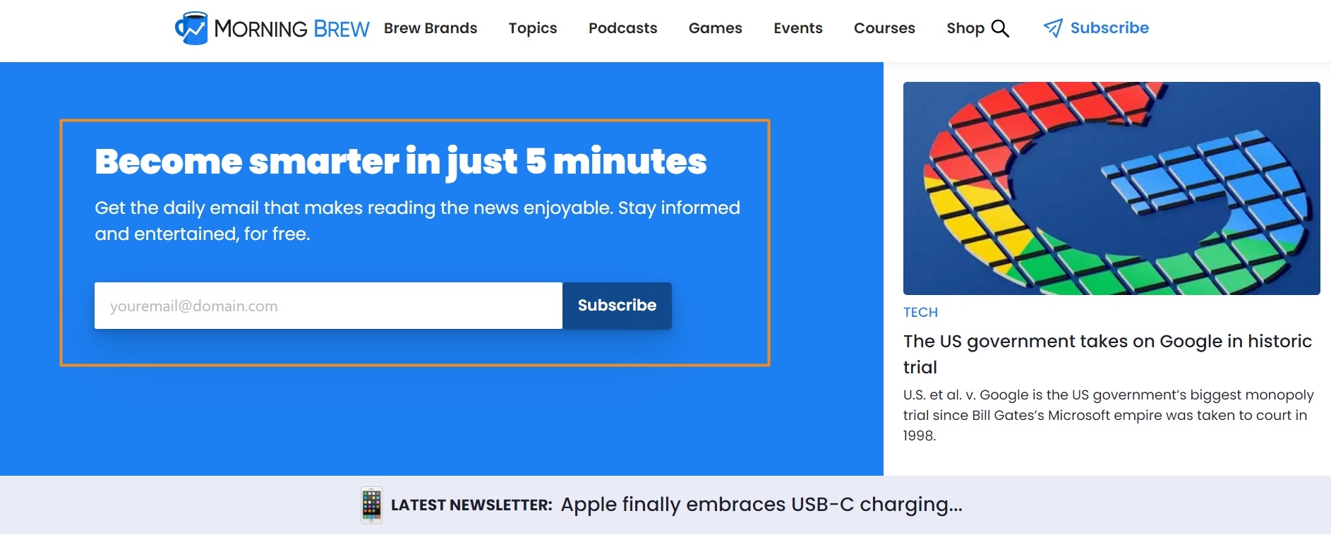
41. Morning Brew
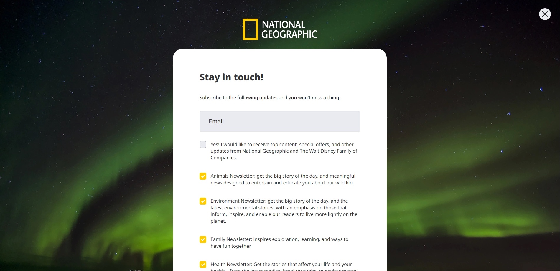
42. National Geographic
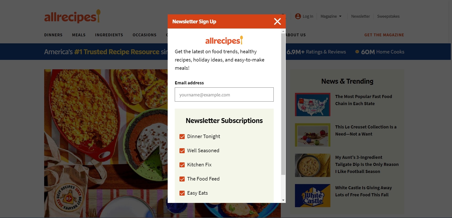
43. All Recipes
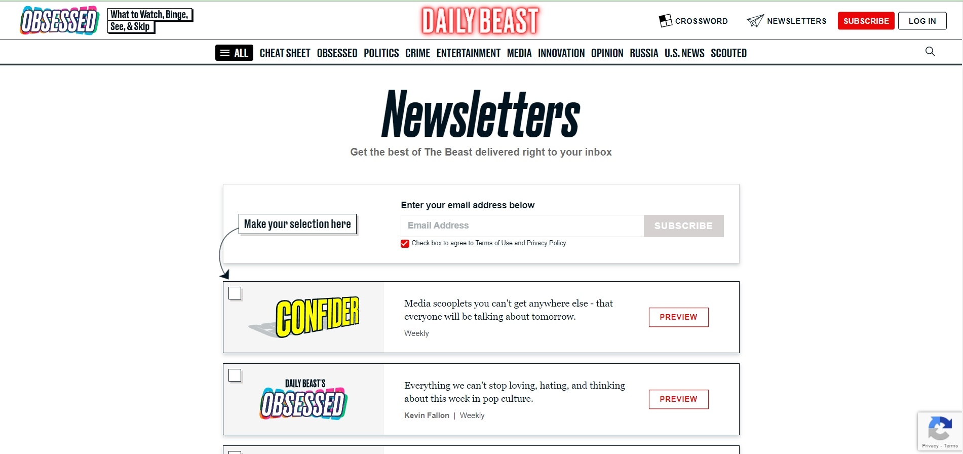
44. The Daily Beast
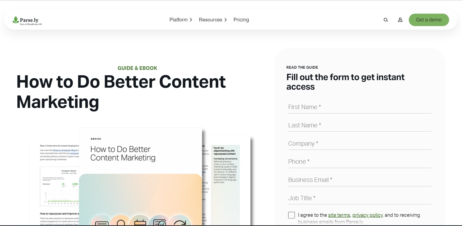
45. Parse.ly
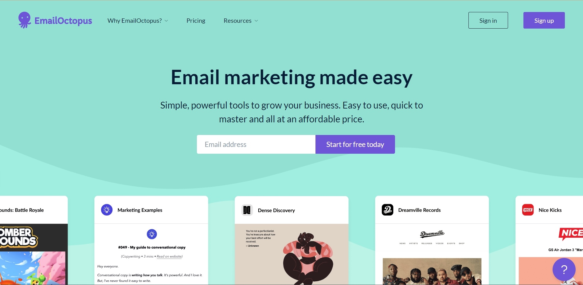
46. EmailOctopus
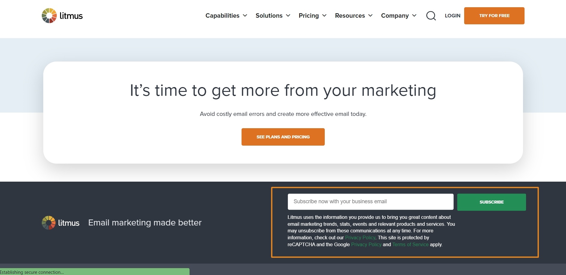
47. Litmus
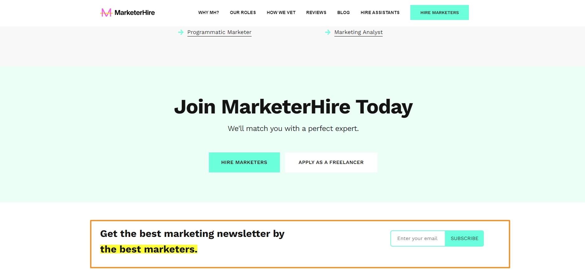
48. MarketerHire
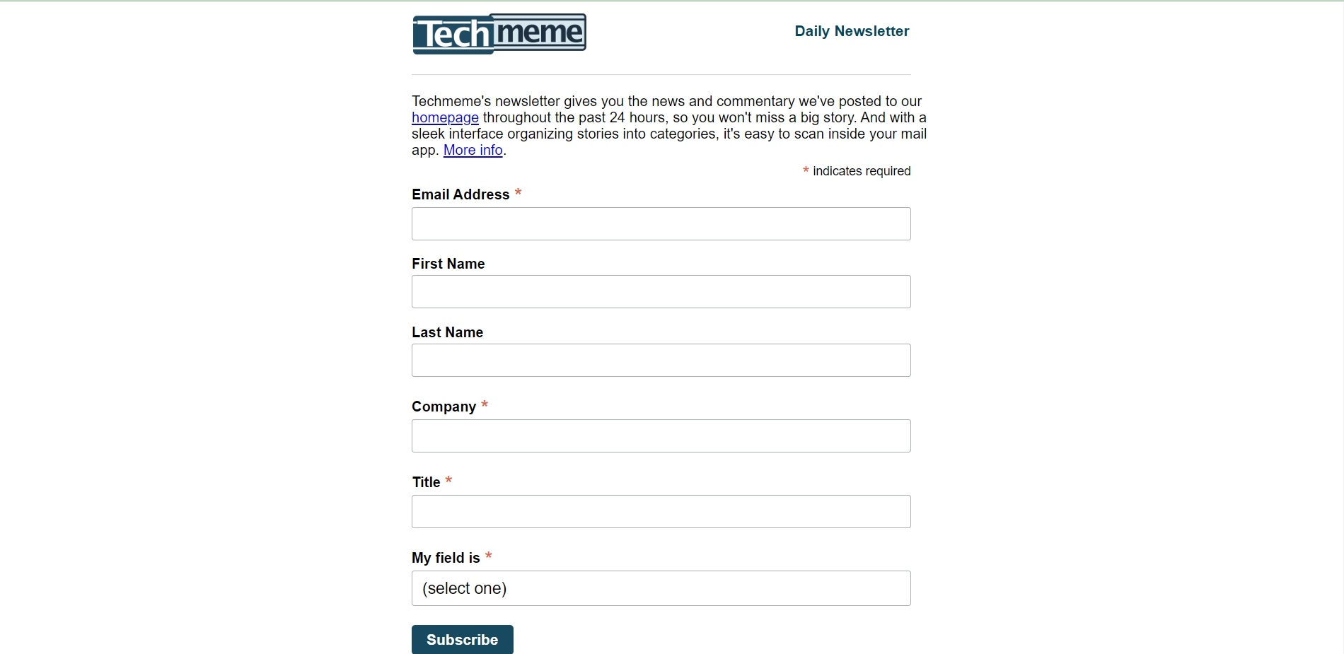
49. Techmeme
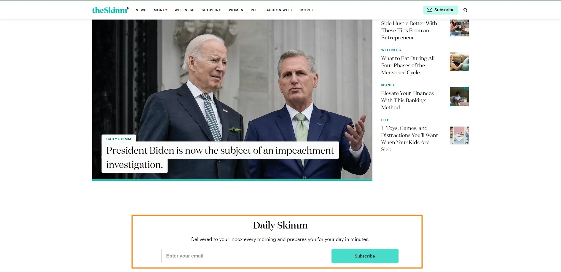
50. The Skimm
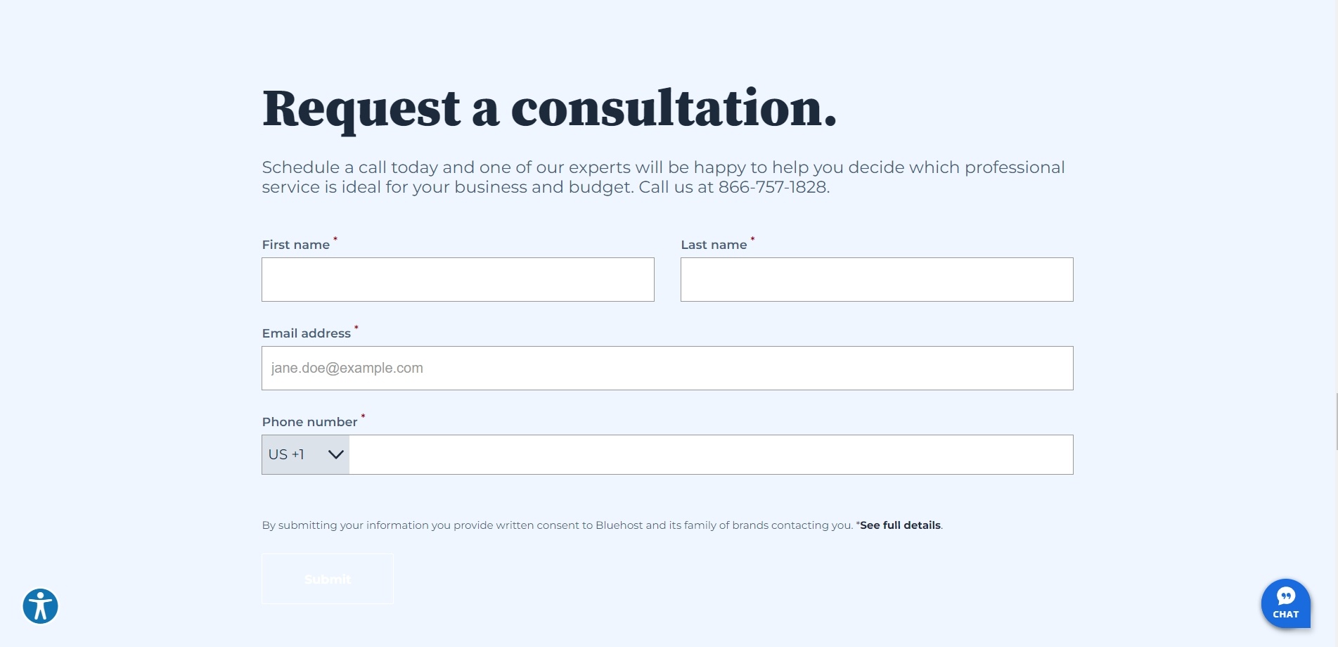
51. BlueHost
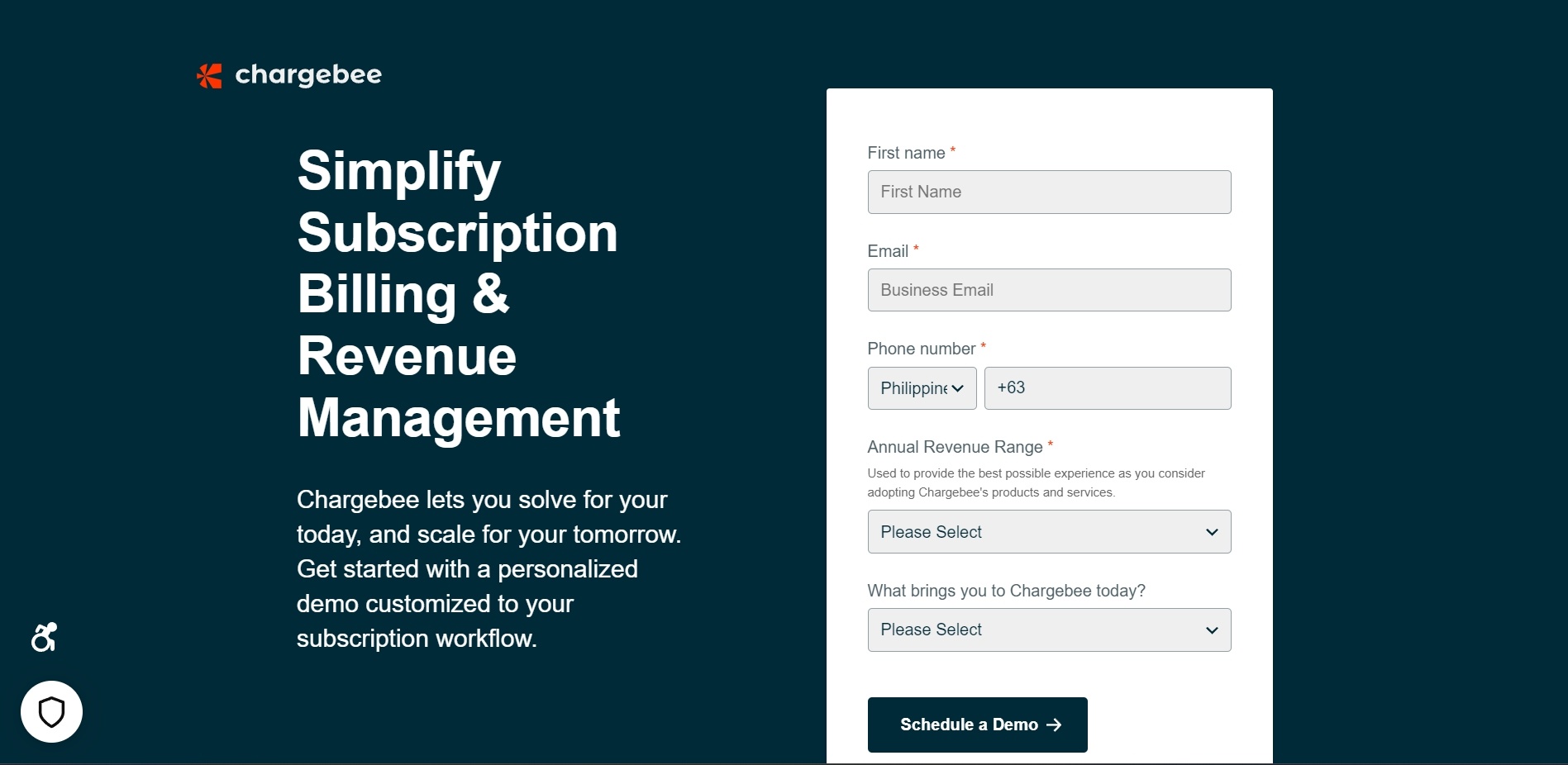
52. Chargebee
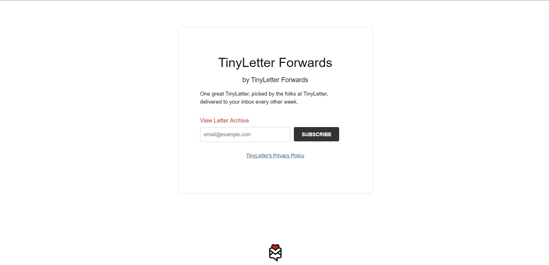
53. TinyLetter Forwards
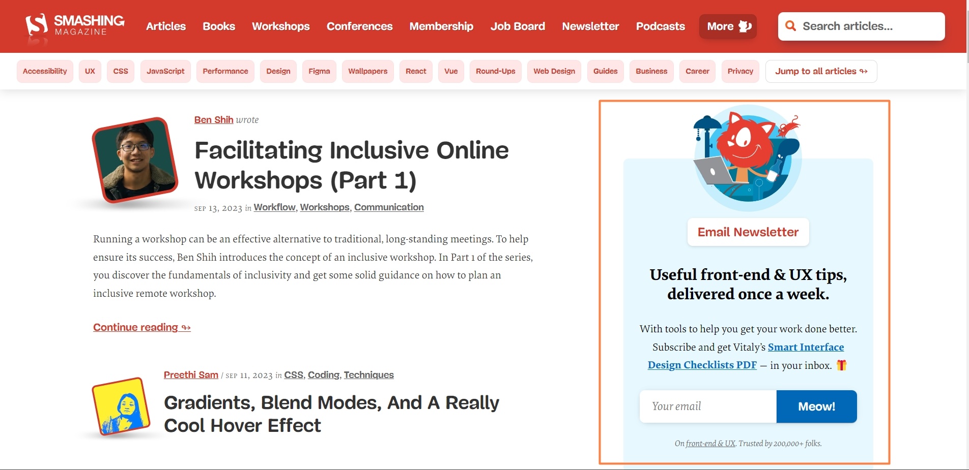
54. Smashing Magazine
Frequently Asked Questions
What is a common element of effective email sign-up forms?
Many effective sign-up forms include clear headlines, risk reversal statements, social proof, and unmistakable CTAs.
How can I optimize email sign-up offers to improve conversions?
Increase conversions by providing clear benefit statements, removing doubts, and making it obvious what subscribers will gain.
Why should I test different approaches for email sign-up offers?
Testing different approaches allows you to find what works best for your target audience and continually improve response rates.
How can I create a compelling email sign-up offer?
Create a compelling offer that dissolves hesitation by providing something so valuable that visitors eagerly want to sign up.
What is the purpose of using progressive fields in an email sign-up form?
Progressive fields can help pre-qualify subscribers, improving list quality by filtering out less serious or uninterested individuals.
To Conclude
So that’s well over 50 email sign-up examples you can use to inspire your own offers to visitors to help build your list.
Use these examples to inspire your own ideas about the kind of offer you can make to visitors in exchange for their email address and other contact information, and model your own sign-up boxes on.
Of course, don’t copy directly, but adjust and adapt to suit your own business and market.
Remember that there’s often a trade-off between the number of fields in your sign-up form and your conversion rate.
The more minimal the form, the higher your conversion rate will tend to be, but you may find your list is also lower quality. More fields help qualify the prospect and likely boost the quality of your list, but you probably won’t get as many people signing up.
As always, test everything and see what works best for you and your market!


