X cards (often still referred to as Twitter cards) help bring X alive, with images, videos, and even opportunities to install apps.
Using X cards helps your posts stand out and get attention, helping to amplify your content, increase your engagement, and grow your reach.
For example, X cards help attract shares. Naturally, users tend to share content that:
- They notice
- Looks attractive and engaging
- Helps make them look good
- Is likely to be of interest to their followers.
X cards help tick all those boxes.
Without them, it's a lot more difficult to amplify your content on the platform.
So what types of X cards are there, and how do you put them into action?
This post gives you everything you need to know to put X cards into action for your own content. They’re easy to use and you’ll start experiencing the benefits almost immediately.
What Is an X Card?
An X card is embedded content that appears within a post on X.
So when you share a link for example, if the website in question has the right code in place (more on that below), a preview of that content is displayed in the post.
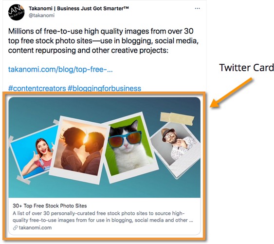
As you can see, the addition of the X card makes the content a lot more visually appealing and engaging than it would be otherwise, while also taking up more screen real estate in the timeline.
Without the benefit of an X card, the post above would be displayed like this:

But X cards aren’t just for sharing basic links to web pages—though two different formats, or types of X card, exist for doing so. More on that in a sec.
X cards can also be used for sharing media like video and audio, and even for apps...
Get Your FREE Custom X Card Cheat Sheet
Get a free custom cheat sheet to quickly enhance your presence on X (Twitter) using X Cards, specific to your needs—it's 100% FREE!
Just hit the button now—it only takes a few seconds! →
What Types of X Cards Are There?
There are four different types of X card as follows, each of which I’ll run through in turn:
- Summary Card—for sharing links

- Summary Card with Large Image—for sharing links

- Player Card—for sharing playable media

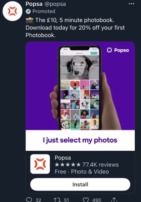
- App Card—for sharing apps
Let’s look at how to actually start putting X cards into action...
How Do You Use X Cards?
In this section, for each card, I’ll give you the code you need to start using it.
They involve using special tags—known as social meta tags—that X looks for to get the information it needs to populate the card.
Some of these tags are optional, and these are indicated below accordingly.
For some tags, if the tag has not been supplied, X falls back on the equivalent Open Graph tag where there is one (Open Graph is a similar mechanism, used for other social sites like Facebook). This means you can avoid duplicating a lot of information in your code.
(Note this does not apply to either X-specific tags, such as twitter:site, or App Cards).
Summary Card
X’s Summary Card shows a small square thumbnail image, with some adjacent summary text shown to the right.
Because of the small-sized image, it’s not as engaging and won’t amplify your content as well as the Summary Card with Large Image, detailed below.
For that reason, this type of card is used much less frequently than the Summary Card with Large Image, but you’ll still see it in action by some users.
Here’s an example from @JayVanHoutte.

The code on his website looked like this:

As you can see, the information from these meta tags are used to populate the information shown in the card.
You’ll notice the top tag, twitter:card, has been set to summary, denoting the type of card to use.
The full set of tags you need for a Summary Card are as follows (more details for each tag can be found below):
<meta name="twitter:card" content="summary">
<meta name="twitter:site" content="@xhandle">
<meta name="twitter:title" content="Content Title Goes Here">
<meta name="twitter:description" content="Description here with text that summarizes   the content of the page. Note this is not displayed on iOS or Android.">
<meta name="twitter:image" content="The URL to an image related to the content, such as a blog post’s featured image">
<meta name="twitter:image:alt" content="Alternative text to show for the image, in the case of visually-impaired users">
Note: all but twitter:card and twitter:title are optional.
For this type of card, X prefers square images, but will simply crop anything different in order to fit the format.
The image should be sized between 144x144 and 4096x4096 pixels, and a file size of up to 5MB is permitted.
Putting this type of card (or the Summary Card with Large Image, below) into action on a site running on WordPress is really straightforward.
First install the Yoast SEO plugin if you don’t already have it.
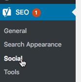
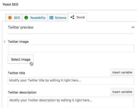
Once installed, click SEO then Social on the sidebar menu.
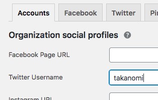
On the Accounts tab, enter your X username if it’s not already there.
Click on the X tab, and ensure the Add X card meta data option is set to Enabled. Then choose which type of card to use, Summary or Summary with large image.
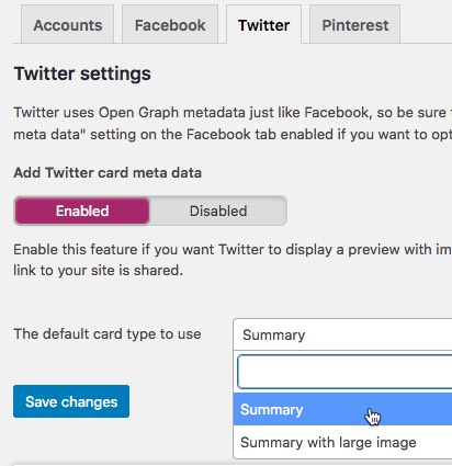
Yoast will then automatically fill in the relevant information for the X card using the featured image for the post, along with the title and description.
You can change this if you wish for individual posts via the Social tab of Yoast.
Get Your FREE Custom X Card Cheat Sheet
Get a free custom cheat sheet to quickly enhance your presence on X (Twitter) using X Cards, specific to your needs—it's 100% FREE!
Just hit the button now—it only takes a few seconds! →
Summary Card with Large Image
The Summary Card with Large Image is similar to the Summary Card above but with—you’ve guessed it!—a larger image.
The larger image is shown at the top of the card, with the title, description and other information shown underneath.
As stated above, because this type of card generally attracts more engagement and is more effective at helping to amplify content, it’s the preferred option for most websites.
Here’s an example from an article on Entrepreneur.com. When someone shares an article on X, it looks something like the following.

Use of the card makes it a relatively attractive, visually appealing piece of content to share.
The code used on the website to populate the card looked like the following:

As you can see above, this time the twitter:card setting is set to summary_large_image.
The full set of tags you need for a Summary Card with Large Image are as follows (more details for each tag can be found below):
<meta name=”twitter:card” content=”summary”>
<meta name=”twitter:site” content=”@username”>
<meta name=”twitter:title” content=”Content Title Goes Here”>
<meta name=”twitter:description” content=”Description here with text that summarizes   the content of the page. Note this is not displayed on iOS or Android.”>
<meta name=”twitter:image” content=”The URL to an image related to the content, such as a blog post’s featured image”>
<meta name=”twitter:image:alt” content=”Alternative text to show for the image, in the case of visually-impaired users”>
<meta name=”twitter:creator” content=”@usernameOfCreator”>
Note: as with the Summary Card, all but twitter:card and twitter:title are optional.
The ideal image for this card should be sized to have an aspect ratio of 2:1. However, if it doesn’t fit, X will simply crop it to do so.
In any case, the dimensions of the image should be between 300x157 and 4096x4096 pixels. As with Summary Cards the file size can be up to 5MB.
To put this into action for a WordPress website, see the instructions above for the Summary Card, this time selecting the Summary with large image option instead.
Player Card
X’s Player Card is for sharing video, audio and other playable media hosted on external websites.
So it might be used to help amplify say a YouTube video, podcast audio—there’s an example of this below—or even a SlideShare presentation.

By using a Player Card, the player for the media is embedded within the X post, which users can then play and otherwise interact with rather than clicking through to an external website.
Here’s an example of how Spotify uses them to promote artists on their platform.

As an example of the code needed for a Player Card, here’s the code Spotify uses to embed the above player into posts on X:

Most users will simply be sharing content from third-party platforms like YouTube that already make full use of X cards.
So you generally won’t need to be concerned with the underlying tags that are required unless you are:
- Are building a website that streams content itself
- Have web pages where the media you want to share for your X posts is playable, rather than say a featured image
If so, the tags you need for Player Cards are as follows—the full details for each tag are available towards the end of this post:
<meta name="twitter:card" content="player">
<meta name="twitter:site" content="@username">
<meta name="twitter:description" content="Description of the video or audio content">
<meta name="twitter:image" content="The URL of an image to be used in place of the player on some platforms where iframes or inline players are not supported">
<meta name="twitter:player" content="Secure HTTPS URL to an iframe player for the        content">
<meta name="twitter:player:width" content="Width of the player in pixels, e.g. 480">
<meta name="twitter:player:height" content="Height of the player in pixels, e.g. 480">
<meta name="twitter:card" content="player">
Note: only twitter:description is optional.
To avoid any confusion, it should be noted that Player Cards appear in different formats depending on where the user is viewing the post in question.
Player Card on Mobile
If you are seeing it via the X app on an iPhone or Android device, it initially appears in the timeline as just a standard post on X with a link, as in this example from @johnleedumas, posting a link to his podcast hosted on libsyn.com:

So it can be easy to assume that the Player Card isn’t working in some way. But this is just how it shows on mobile.
Tapping the post reveals the card, initially expanding to show the thumbnail image (twitter:image) with a play icon on top, and a further tap opening the player and playing the media.

Player Card on Desktop
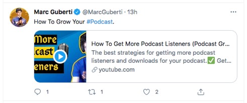
On desktop, it’s more obviously a Player Card.
The thumbnail with the play icon are shown directly in the timeline, in a format resembling a Summary Card.
Here’s an example from @MarcGuberti.
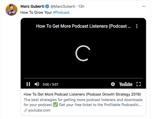
Clicking the post expands it so that it then shows the player and starts to play the media.
App Card
Finally, App Cards are designed for developers of mobile applications, enabling them to advertise their app, including an Install button shown in the post.
They are less relevant for amplifying content, but I include the format briefly here in case you have an app related to your website that may in some way help to do so.
App Cards can be shown on desktop, but tend to be more common when using X via their mobile app.
The data needed to display all the information in an App Card is retrieved directly from Google Play or the App Store. Your app therefore needs to be listed as public in order to make that data retrieval possible.
Here’s an example from @fastic of how an App Card might show up in the feed.

The tags you need for an App Card are as follows (based on sample code X provides)—more details for each tag can be found below:
<meta name="twitter:card" content="app">
<meta name="twitter:site" content="@TwitterDev">
<meta name="twitter:description" content="Cannonball is the fun way to create and share stories and poems on your phone. Start with a beautiful image from the gallery, then     choose words to complete the story and share it with friends.">
<meta name="twitter:app:country" content="US">
<meta name="twitter:app:name:iphone" content="Cannonball">
<meta name="twitter:app:id:iphone" content="929750075">
<meta name="twitter:app:url:iphone" content="cannonball://poem/5149e249222f9e600a7540ef">
<meta name="twitter:app:name:ipad" content="Cannonball">
<meta name="twitter:app:id:ipad" content="929750075">
<meta name="twitter:app:url:ipad" content="cannonball://poem/5149e249222f9e600a7540ef">
<meta name="twitter:app:name:googleplay" content="Cannonball">
<meta name="twitter:app:id:googleplay" content="io.fabric.samples.cannonball">
<meta name="twitter:app:url:googleplay" content="http://cannonball.fabric.io/poem/5149e249222f9e600a7540ef">
Note: twitter:description, twitter:app:country, twitter:app:url:iphone, twitter:app:url:ipad and twitter:app:url:googleplay are all optional.
Get Your FREE Custom X Card Cheat Sheet
Get a free custom cheat sheet to quickly enhance your presence on X (Twitter) using X Cards, specific to your needs—it's 100% FREE!
Just hit the button now—it only takes a few seconds! →
Tag Details/Reference
- twitter:card—this is where you declare the type of card you want to use, either summary, summary_large_image, player or app.
- twitter:site—use this to set the X username or handle of the website, e.g. @EverywhereMktr.
- twitter:creator—use this to reflect the X username of the content creator. Only applicable to summary_large_image cards.
- twitter:creator:id—the user ID of the content creator (note this is different to the username). This is only really useful for summary cards where you can’t otherwise use twitter:creator.
- twitter:description—the description of the content. Anything over 200 characters will be truncated. Not used for app cards.
- twitter:title—the title of the content. Anything over 70 characters will be truncated. Not used for app cards.
- twitter:image—the URL of the image you want to display. Can be a JPG, PNG, WEBP or GIF image. Animated GIFs and SVG images are not supported. Not used for app cards. For player cards, denotes image used in place of player where iframes or inline players are not supported: should be the same dimensions as the player, and for the image to be displayed must be larger than 262x262 pixels for a square image or 350x196 for a 16:9 image.
- twitter:image:alt—description of the image, used for visually-impaired users. Not used for app cards.
The following tags are for Player Cards only:
- twitter:player—the secure URL of the player iframe. Must be a secure URL, it must not require plugins, and must not generate active mixed content warnings when loading the URL via a browser.
- twitter:player:width—pixel width of the player iframe.
- twitter:player:height—pixel height of the player iframe.
- twitter:player:stream—URL of raw video or audio stream.
The following tags are for App Cards only:
- twitter:app:name:iphone—name of the iPhone app.
- twitter:app:id:iphone—ID of the app in the iTunes App Store (be careful not to use the bundle ID).
- twitter:app:url:iphone—custom URL scheme for your app (remember to include “://” after the scheme name
- twitter:app:name:ipad—name of the iPad app
- twitter:app:id:ipad—ID of the app in the iTunes App Store
- twitter:app:url:ipad—custom URL scheme for your app
- twitter:app:name:googleplay—name of your Android app
- twitter:app:id:googleplay—ID of the app in the Google Play Store
- twitter:app:url:googleplay—custom URL scheme for your app
Validating Your X Card
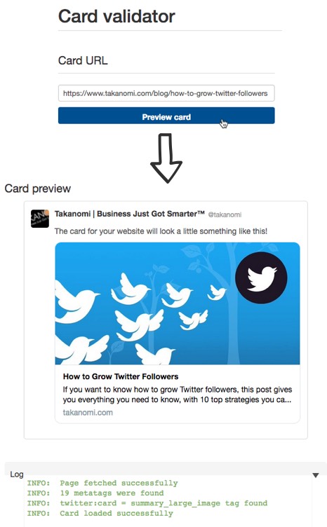
After adding the relevant social meta tags to your page, you should now validate the card to ensure it’s displayed as you intend.
X provides a Card validator to do just that—simply enter the URL of your web page and preview the card.
Here’s an example, using a previous post on how to grow X followers:
Frequently Asked Questions
What is an X card?
An X card is embedded content that appears within a post on X.
What types of X cards are there?
There's a Summary Card, Summary Card with Large Image, Player Card, and App Card.
How do you use X cards?
To use X cards, add specific meta tags to your website's code. Each card type requires different tags for content display.
To Conclude
This post has given you everything you need on how to use X cards and put them into action, including details on the four different types of card available.
For WordPress sites, I’ve shown you an easy shortcut for using Summary and Summary with Large Image cards, but otherwise you have the full set of tags that you need and the different options available.
The use of X cards is now essential for amplifying your content—use the information in this post to ensure you’re using them to their maximum potential.
Get Your FREE Custom X Card Cheat Sheet
Get a free custom cheat sheet to quickly enhance your presence on X (Twitter) using X Cards, specific to your needs—it's 100% FREE!
Just hit the button now—it only takes a few seconds! →
